
.webp?width=1921&height=622&name=usecase-banner%20(1).webp)
Introduction to Data Visualization
A picture is worth a million words – especially when you are trying to understand and discover insights from data. Visuals are especially helpful when you’re trying to find relationships among hundreds or thousands of variables to determine their relative importance – or if they are important at all. Data Visualization, as its name Data and Visualization, describes the term. Data Visualization means to visualize the raw data so that one can understand the information easily. Some elements of data visualization are:
1. Simple Analysis
2. Clear Handling and Keys
3. Summaries of Key Points
4. Add Design Elements
3D Dimensional data which provides the perception of depth, breadth, and height. Click to explore about, What is 3D Data Visualization?
Why is Data Visualization Important?
So here is the answer: most industries like the health industry, IT sector, HR, logistics, marketing, and so many of them require that data should be carried in such a way that they can track insights daily, weekly, monthly, and quarterly and yearly basis. So the solution for that problem is a dashboard with data visualization charts and graphs. As we know, dashboards give a clear vision and perspective to decide whether it is normal or crucial for your organization easily.
For example, you can check this screen recording for a sample dashboard with data visualization. With the help of graphs and charts, you can easily understand the purpose of this dashboard. There are four main reasons we visualize data-
1. Digest large amounts of data at scale.
2. Compare and contrast.3. Spot trends and patterns Customized.
4. Reveal questions that would otherwise be missed.
Data visualization can also:
1. Identifies areas that need attention or improvement.
2. Clarifies which factors influence customer behavior.
3. Predicts sales volumes.
4. Helps you understand which products to place where.
What are the best Data Visualization Techniques?
To create meaningful visuals output of your data, there are some basic techniques and tips you should consider. Size of the data and composition play an important role when selecting graphs to represent your information. Before we move further here are some of the tips that you need to keep in your mind:
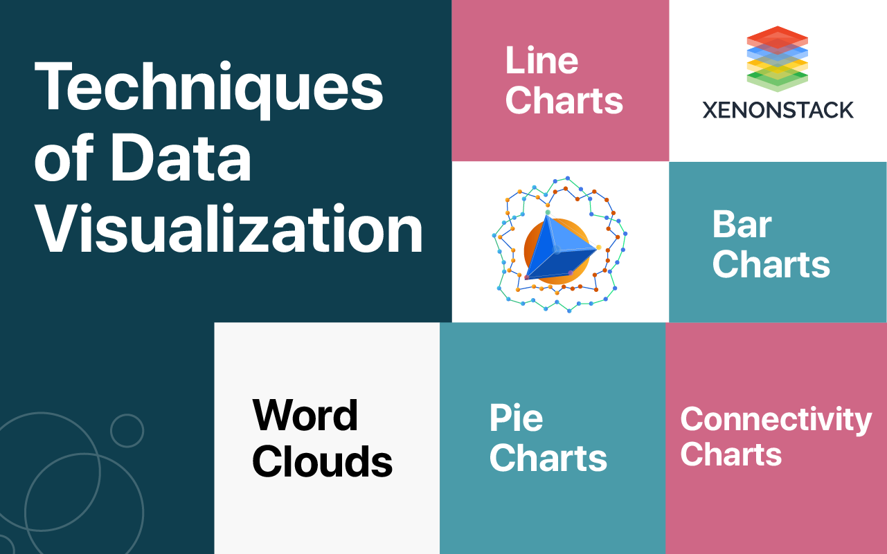
1. Word Clouds
Word clouds give corporations the idea of how frequently a word is used. The words in the cloud are of various sizes. The larger the scale – the higher the frequency. This technique may be helpful, for a model, for sentiment analysis of the customers’ social media posts.
2. Connectivity Charts
Connectivity charts show the links between aspects or events. The chart below shows the connections between machinery failures and their triggers, as well as the strength of these connections. Visualization techniques that work for both traditional and big data Some of traditional data visualization techniques accommodate big data as well.
3. Line Charts
Line charts allow watching on the behavior of one or several objects variable over time and recognizing the trends. In traditional Business Intelligence, line charts can show sales, revenue development and profit for the last one year. When running with big data, organizations can use this visualization technique to track total website clicks by weeks, the average number of complaints/requests to the call center by weeks or by months, etc.
4. Pie charts
Pie charts present the components of the whole. Organizations that work with both big data and traditional may use this technique to look at client segments or market shares. The difference between them lies in the sources from which these organizations take raw data for the analysis.5. Bar charts
Bar charts are used to compare the values of different variables. In traditional BI, companies can analyze their sales by category, the costs of marketing promotions by channels, etc. When analyzing big data, companies can look at the visitors’ engagement with their website’s multiple pages, at the most frequent pre-failure cases recognized by sensors and more.Data Visualization Techniques uses charts and graphs to visualize large amounts of complex data. Click to explore about, Advanced Data Visualization Techniques and its Features
Data Visualization for Big Data, Data Science, and IoT
Data visualization can be helpful in many sectors. Here are some of the popular sectors: By using data visualization, it became easier for business owners to understand their extensive data in a simple format. The visualization method is also time-saving, so business does not have to spend much time to make a report on any work or solve a query. They can quickly do it in less time and in a more attracting way. Visual analytics shows a story to the viewers by their work. By using charts and images or graphs, a person can easily represent the whole concept. As well the viewers would be able to understand the entire thing easily. The most complicated data will seem easy when it undergoes the process of visualization.
Big data report gets transformed into a simple format. And it helps us to understand the concept in a natural way. With the Data visualization process, it gets more comfortable for the business manager to understand their product growth. The visualization tools can be very useful to monitor an email campaign. Or company’s initiative regarding something. Market competition in a better way.
What are the benefits of Dashboard?
The benefits of dashboard are listed below:
1. Data Accessibility
You can easily access your data and set your tasks, actions, and decisions as per the priorities.
2. Data Visualization
You can get an exact and better visualization of data from your dashboard’s home screen.
3. Better Decision Making
Now we know that if the data and visuals are crystal clear and understandable, it will help us make the right call for the organization.
4. Accountability
Now, if the right decisions are made, we can say that the accountability will be improved and increased of the organization.
5. Interactivity
In an organization, multiple heads of the organization from different departments check the dashboards. With the help of the dashboard data visuals, it will be easy to communicate between internal team heads. It can mutually take a decision that will be beneficial for the organization and its growth.
6. Gamification
As we know, data are displayed like charts, graphs, and multiple visualizations to give a gamified view.
What is the role of Reactjs in Data Visualization?
As I told that React works on components. With the help of components, we can do the small modules that can be stateful or stateless, and pass the data to them with the props. The benefit of making a component is to use the component again and again in the same project. We can make reusable component so that if we have some data in our app, we don’t need to create a new component every time. We all know that technology is changing day by day and people’s interest is also evolving with it. So, for a company or an organization has to be updated with the people interest.
A company whether it is selling any product or has to arrange its employee record, it needs to have a database. But the problem doesn’t resolve here. A person can not understand the significant amount of raw data. To overcome this situation we started using charts and graphs. So one can easily assume the information what the data has hidden in it. There are so many javascript libraries, available free of cost for creating graphs, charts or treemaps by the raw data. D3.js, Canvas.js, Highcharts.js, etc. are the best example of it.
Significance of ReactJs for dashboards and data visualizations in modern businesses
1. Component Reusability
With ReactJs for dashboards and data visualization, you can create modular and self-organized code to get your dashboard app development off to a good start.
You have to visualize the features and aspects you want in your dashboard.
ReactJS allows you to reuse components, making them self-contained and organized.
Explore more about the concept of ReactJs.
2. Virtual DOM
Because of ReactJS's virtual DOM structure, you can get updates to your dashboard quickly and easily. Dashboards are designed to be accurate in real-time, so real-time data is displayed on the screen in front of the user. Because of React's virtual DOM architecture, component re-rendering is possible. ReactJS dashboards provide real-time notifications, continuous updates, and data charts on the fly.
3. Isomorphic JavaScript
A dashboard should function similarly to a client-side single-page application (SPA) with fast rendering. When a user has to wait for a few seconds, it becomes unappealing, and isomorphic javascript allows for fast rendering of web pages.
Isomorphic javascript overcomes business concerns such as:
- Inadequate SEO
- Poor performance
- Maintainability is excellent.
Further Investigate about JavaScript.
4. Continuous Development of Library
React developers keep you up to date on the most recent features and react libraries. As a result, you can be confident that using ReactJS for dashboards and data visualization will propel your company to the forefront of cutting-edge trends.
5. Great Ecosystem
React provides you with a large community of pre-built solutions to reuse. The majority of reactJS developers quickly find solutions to their problems. You can reuse charts, documentation tools, graphics, and other components.
A query based language for REST APIs used to retrieve the exact data needed Click to explore about, Overview of GraphQL Features and Tools
Examples regarding React Js for Dashboards and Data Visualization
1. Marketing KPI Dashboards
These dashboards display critical business information quickly and interactively, assisting marketing personnel in making critical business decisions.
2. Sales Dashboards
To remain competitive, your company must cultivate a data-driven culture. The ReactJS sales dashboard directs your sales time with the appropriate performance indicators and business metrics, ensuring that your company remains at the top of the charts.
3. Executive Dashboards
Using the digestible data from the dashboards, business executives can monitor, track, and report, allowing them to execute flawless business actions.
4. Stripe Dashboards
An incredible dashboard design responds to relevant user queries and displays ideal fit margins for each card. Users easily and quickly understand the graphical images.
5. Weather App Mobile Dashboard
An easy-to-understand React JS mobile app dashboard connects the breadcrumbs with flawless navigation.
6. Instagram Professional Profile Mobile Dashboard
If you are using a professional account on Instagram, it will help users track your insights and reach of your account. It is the best example of a Mobile Dashboard with millions of Data.
What is GraphQL?
GraphQL is a query language for the APIs for fetching your data and runtime for satisfying those queries with your current data. It is an alternative for the REST APIs. GraphQL is a multi-platform language. It works for all type of clients including Android, iOS or web. GraphQL provides comprehensive and understandable information of the data in your API, gives clients the endowment to ask for exactly what they want and nothing more their need, makes it easier to evolve APIs over time, and enables powerful developer tools. GraphQL works on a single endpoint principle. You send a query to that endpoint/API by using a special Query language syntax. The server responds to a question by providing a JSON object. Let’s see an example of such a query. GET /graphql?query={ person(id: "1") { name } } It will return JSON data like this: { “Name”: “BOB” }
Get more information regarding GraphQL which will be beneficial for you.
What is Rest?
REST is a de-facto architecture standard, but it has no specification and tons of personal definitions. GraphQL has a specification draft, and it’s a Query Language instead of architecture, with a well-defined set of tools built around it. While REST is created on top of an existing architecture, which is the most common scenarios is HTTP, GraphQL is building its own set of conventions. Which can be an advantage point, since REST benefits for free by caching on the HTTP layer.A Single Endpoint
GraphQL has only one parameter, where you send all your queries. With a REST approach, you create multiple endpoints and use HTTP verbs to distinguish read actions (GET) and write actions (POST, PUT, DELETE). GraphQL does not use HTTP verbs to determine the request type. GraphQL makes it simple to monitor for fields usage With REST, except forcing sparse fieldsets, there is no way to determine if clients server uses a variable, so when it comes to deprecating or refactoring, it’s impossible to decide on actual usage. GraphQL makes it possible to monitor which fields are used by clients.
Tailored to your needs
The REST API will usually return you much more data than what you need unless you constrain the API server as well, and you customize your responses for each different request. With GraphQL you explicitly request just the information you need, you don’t “opt out” from the full response default, but it’s mandatory to pick the fields you want. This helps saving resources on the server, since you most probably need less processing, and also network savings since the payload to transfer smaller.
A method of translating raw data into visual forms like charts, graphs, and maps. Click to explore about, Best Practices for Data Visualization
What is the Role of GraphQL in Data Visualization?
To link the react with the GraphQL we should have known about GraphQL. You all might be thinking that GraphQL might be libraries for plotting graph. But you are wrong. It is not a library for graphs. GraphQL is a query language for the API and server-side runtime. It is a type system which we define for our data to execute the queries over the API. GraphQL isn't connected to any specific database or storage system and is instead backed by your existing code and data.
For example, we have to fetch the users details of first 100 people of our organization, so we can set the limit parameter using GraphQL so that our API returns only 100 users details. A GraphQL service is generated by defining types and fields on those types, then providing functions for each field on each type. For example, a GraphQL service that tells us who the logged in user is (me) as well as that user's age might look something like this:
type Query { me: User } type User { id: ID name: String age: Integer } Along with functions for each field on each type:
function Query_me(request) { return request.auth.user; }
function User_age(user) { return user.getAge(); }
Once a GraphQL service is running, it can be sent GraphQL queries to execute and validate. A received query is first verified to ensure it only relates to the fields and types defined, then runs the provided functions to produce a result. For example the query:
{ me { name } }
{ "me": { "name": "Luke Skywalker" } }
To link the GraphQL with React.js app, we can use Relay. A relay is a javascript framework for building the data-driven React applications powered by GraphQL. It is designed from the ground up to be easy to use, extensible and, most of all, performant. It is also developed by the Facebook. React allows designs to be defined as components where every component is responsible for rendering a part of the HTML. Composing other components is how to build complex UI designs. Each React component doesn't need to know the internal workings of the composed components.
Relay links React with GraphQL and develop the idea of encapsulation further. It allows components to define what data they need and the Relay framework gives the data. This makes the data needs of inner components covered and allows composition of that reqData Visualization with GraphQL and React.jsuirements. Thinking about what data an app request becomes localized to the component making it easier to reason about what fields are needed or no longer needed. Relay life cycle has three points.
1. Declarative - Declare the data your component needs with GraphQL, Relay manages how and when to fetch your data.
2. Colocation - GraphQL is written next to the component that relies on them. Relay aggregates query into efficient network requests
3. Mutations - Write GraphQL mutations and Relay offers automatic data consistency, optimistic updates, and error handling.
4. Declarative - Declare the data your component needs with GraphQL, Relay manages how and when to fetch your data.
5. Colocation - GraphQL is written next to the component that relies on them. Relay aggregates query into efficient network requests.
6. Mutations - Write GraphQL mutations and Relay offers automatic data consistency, optimistic updates, and error handling. Recently Facebook launched the Relay Modern, that is the latest version of Relay. Relay Modern is designed to be easier to use, more extensible and, most of all, able to improve performance on mobile devices. It accomplishes this with static queries and ahead-of-time code generation.
A javascript library for building declarative, efficient, and interactive user interfaces. Click to explore about, Learn React | Advanced Guide for Angular Developers
Runtime Architecture of the Relay
The Relay runtime is a full-featured GraphQL client that is developed for high performance even on low-end mobile/tablets devices and is equipped for scaling to vast, complex applications. The runtime API isn't expected to be utilized straightforwardly in the product code, yet instead to give an establishment to building more elevated amount product APIs, for example, React/Relay. This framework includes-
Know more about the Importance of APIs Testing.
1. A normalized, in-memory object graph/cache.2. A mechanism for fetching data from the cache and subscribing for updates when these results change due to a subscription update, mutation, etc.
3. An optimized "write" process for updating the cache with the results of queries/mutations/subscriptions.
4. A generic mechanism for intercepting data before publishing it to the cache and either synthesizing new data or merging new and existing data (which among other things enables the creation of a variety of pagination schemes)
5. Garbage collection to evict entries from the cache when any view can no longer reference them.
6. Mutations with the ability to update the cache with arbitrary logic and optimistic updates.
7. Support for live queries where supported by the network/server.
8. Core primitives to enable subscriptions.
Core primitives for building offline/persisted caching. Example Data Flow: Fetching Query Data The query is fetched from the network/backend. The query and response are traversed together, extracting the results into Record objects which are added to a fresh RecordSource. This fresh RecordSource would then be published to the store: Publishing the results updates the store but does not immediately notify any subscribers. This is accomplished by calling notify()..which requests the callbacks for any subscribe()-ers whose results have changed.
Each subscription is tested as follows: First, the list of data IDs that have been changed since the last notify() is compared corresponding data IDs listed in the subscription's latest Snapshot. If there is not any overlap, the subscription's results cannot possibly have been changed. In this case, the subscription is ignored. Unless processing continues. Second, any subscriptions that have overlapping data IDs are re-read, and the new/previous results are compared.
If the result has not been changed, the subscription is ignored (this can occur if a field of a record changed that is not relevant to the subscription's selector), otherwise processing continues. Finally, subscriptions whose data changed are notified via their callback.

Conclusion
React JS is a great Framework with some essential features for developing high-quality applications. Immediate visualization of work result, high rendering speed and proficient operation of components associated with the Reactjs is the most significant advantage of this tool. As far as some needs are concerned, we can summarize that React JS was designed from the start as an excellent representation layer and it just performs this primary role with excellence. React holds an extensive and highly developed ecosystem which consists of compatible add-ons, plugins, libraries, and frameworks. On the contrary, great thanks to specifics of its DOM manipulation system, using React in parallel with any other tool which changes DOM or part, therefore, is quite a challenging task.
- What are the importance of Tableau Data Visualization?
- Read here about Data Visualization Best Practices
- Explain the concept of Data Visualization with Microsoft Power BI.


