
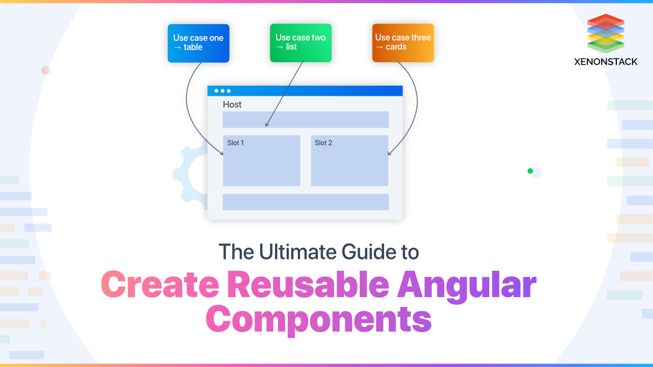
.webp?width=1921&height=622&name=usecase-banner%20(1).webp)
Introduction to Reusable Angular Components
Components that define a base structure/behavior but still can be used in various contexts/ dynamic content. Every time you use a reusable component, you also have a parent component. This flexible content inside its component comes from parent content and ends up in a dedicated slot inside the component. So it is projected down to the parent component.
Examples: Buttons, Spinners/ Loaders, tab, Dropdowns, Search Bar, etc.
The performance and the load time play an essential role in any business. Click to explore about, Performance Optimization Techniques in Angular
What are the levels of Reusability of a component?
- Templating: Reuse markups across components, Future changes are simple
Don't forget to update all the different implementations, e.g. Button - Configuration: Props to create variation in their behavior [loading state, disabled state]
- Adaptability: Allow the child component to control our markup of the parent component (more flexible than props) [ slot for content inside a component]
- Inversion: Tell the child how to render (customize render a list of items)
- Extension: Extend the behavior of a component in many ways
- Nesting: Apply for extension through the component hierarchy. Each component extends with more specific functionality.
Why do we use it?
- Efficiency: Reuse markups across components, Future changes are simple
- Consistency: Updating reusable components get affected everywhere it is used
- Easy to Test: Things become easy to test when they follow SRP
An open-source, server-side runtime atmosphere established on Google Chrome's V8 JavaScript transformer. Click to explore about, Node.js vs. Golang
How to create Reusable Angular Components with examples?
Steps to create reusable angular components are described below:
ng-template
- app-header.component.ts (reusable child component)
- homepage-header.component.ts (parent component)
Angular ngTemplateOutlet can be used to insert a common template in various sections of a view. Here we have inserted the homePageHeader template inside the app-header component, a reusable component where anything from a parent can be inserted into the child view using templateRef. Therefore you get customized/ modified changes from the parent component & reusable code from the child component.
UI in Browser
Welcome to Home Page
<h4> Welcome to Home Page </h4>
Heading
<button>Heading</button>
ng-content
No reference is required like we do in the ng template. We wrap the child-reusable component selector with the content in the parent component that we want to display inside the ng-content of the child component. Same UI as we saw in the ng-template diagram
child-reusable-component.component.ts
@Component({selector: "app-child-reusable",template: `<h1> <ng-content></ng-content></h1><button>Heading Button</button><!--Other stuff->` `})
parent-reusable-component.component.ts
<app-child-reusable>Xenonstack</app-child-reusable>
- ng-content [select]
Select with HTML Tags :
<widget-comp><h2> Title </h2><div> Some content </div><h3> Footer <h3></widget-comp>
@Component({selector: "widget-comp",template: `Displaying content from where it is called <ng-content select="h3"><ng-content><ng-content select="div"><ng-content><ng-content select="h2"><ng-content>`})export class WidgetComponent {}
Projecting content with select Title will be displayed inside h3 select, Some content inside div select & so on. Order in the parent component does not matter as select attributes in ng-content are in a specific order to display.
Similarly, we can activate the same select with class & attributes as shown below.
- By class
<h2 class="my-header"> Title </h2>
<ng-content select=".header"><ng-content>
- By attribute
<widget-comp><h2 header> Title </h2><div content> Some content </div><h3 footer> Footer <h3></widget-comp>
@Component({selector: "widget-comp",template: `Displaying content from where it is called<ng-content select="[header]"><ng-content><ng-content select="[content]"><ng-content><ng-content select="[footer]"><ng-content>`})export class WidgetComponent {}
Angular is one of the solutions for single-page application development alongside React. Click to explore about, Learn Angular | Perfect Guide for React Developers
What is the difference between ng-content and ng-template?ng-content?
| ng-content | ng-template |
| The projected content lifecycle is bound to the parent lifecycle | Passed templates lifecycle are not bound to the parent lifecycle hook |
| Use ng-content for most scenarios | Use whenever you encounter ng-content inside ngIf |
DOM Access & Manipulation
@Component({selector: 'widget-Input',template: `<input #myInput type="text" [value]="message">`})export class WidgetInput {@ViewChild('myInput') input;@Input() message = "default value!";constructor(private renderer: Renderer) { }ngViewAfterInit() { //after view is initthis.input.nativeElement.focus(); //nativeElement property may not present in old browser we use Rendererthis.renderer.invokeElementMethod( //safelythis.input.nativeElement, 'focus'}}
The widget input component is a simple component that manipulates entered messages or adds messages through parent components using dom-manipulation through template reference.
Note: entry components: [ComponentName] in modules,
you are saying that you are going to use it somewhere in your code.
Therefore angular compiler does not discard it to reduce bundle size.
Create Dynamic Components with ViewContainer
import { Component, ViewChild, ViewContainerRef} from "angular-core"@Component ({selector: 'home',template: `<button (click)="onClick()">Add Component</button><div #container></div> `})export class HomeComponent {@ViewChild('container', {read: ViewContainerRef}) container;constructor(private resolver: ComponentFactoryResolver) { }ngAfterViewInit( ) {const widgetFactory = this.resolver.resolveComponentFactory(WidgetInput);this. container.createComponent(widgetFactory);this. container.createComponent(widgetFactory);const widgetRef = this.container.createComponent(widgetFactory, 2)widgetRef.instance.message = "I' m last';}onClick( ) {const widgetFactory = . this.resolver.resolveComponentFactory(WidgetInput);this. container.createComponent(widgetFactory, 3);widgetRef.instance.message = "I'm fourth"}}
We can render any component any number of times throughout template refrace & using component FactoryResolver. Here we are rendering the input-widget component again and again with a click of Add Component.
- Approach2:(Easy way using createEmbeddedView)
import { Component, ViewChild, ViewContainerRef} from "angular-core";@Component ({selector: 'home',template: `<button (click)="onClick()">Create Template</button><template #template let-description=”description”><h2>My template </h2><button> My button </button></template>`})export class HomeComponent {@ViewChild('template') template;@ViewChild('container', {read: ViewContainerRef}) container;widgetRef;constructor() { }onClick() {this.container.createEmbeddedView(this.template, {description: ‘hello World’})}}

Compound Component
It give parents more control over how the system works.
SwitchComponent is the actual checkbox button UI Component & when it is clicked, an event is fired to the ToggleButtonComponent, which stores the state of the checkbox. It updates itself & emits the toggle value. Now the toggle emitEvent is subscribed at ToggleComponent, which updates all components {ToggleOffComponent & ToggleOnComponent, ToggleButtonComponent } values through @ContentChild
- app.component.html
<toggle (toggle)="onToggle($event)"><toggle-button></toggle-button> <!--🔘 Checkbox –-><toggle-on>🌞 Day </toggle-on><toggle-off>🌙 Night </toggle-off></toggle>
- toggle.component.ts (smart component)
import { Component, Input, Output, EventEmitter, ContentChild, AfterContentInit, OnChanges, SimpleChanges } from '@angular/core';import { ToggleOnComponent } from './toggle.on.component';import { ToggleOffComponent } from './toggle.off.component';import { ToggleButtonComponent } from './toggle.button.component';@Component({selector: 'toggle',template: '<ng-content></ng-content>',})export class ToggleComponent implements AfterContentInit, OnChanges {@Input() on: boolean;@Output() toggle: EventEmitter<boolean> = new EventEmitter();@ContentChild(ToggleOnComponent) toggleOn: ToggleOnComponent;@ContentChild(ToggleOffComponent) toggleOff: ToggleOffComponent;@ContentChild(ToggleButtonComponent) toggleButton: ToggleButtonComponent;ngAfterContentInit() {this.toggleButton.toggle.subscribe(on => {this.on = on;this.toggle.emit(on);// emit to its parentthis.update();});}//if any input field (on state) change update all componentsngOnChanges(changes: SimpleChanges) {const { on } = changes;if (on) {this.update();}}update() {this.toggleOn.on = this.on; //changing values on component levelthis.toggleOff.on = this.on; //changing values on component levelthis.toggleButton.on = this.on; //changing values on component level}}
The above component is responsible for subscribing data of the toggle checkbox button & notify all the components whoever needs it ToggleComponent
- toggle.button.component.ts
import { Component, Input, Output, EventEmitter } from '@angular/core';@Component({selector: 'toggle-button',template: '<switch [on]="on" (click)="onClick()" ></switch>',})export class ToggleButtonComponent {@Input() on: boolean;@Output() toggle: EventEmitter<boolean> = new EventEmitter(); //toggle is subscribed at parent levelonClick() {this.on = !this.on;this.toggle.emit(this.on);}}
The above component is responsible for the functionality of the toggle checkbox & contains the state of the button which is subscribed to
- switch.component.ts
import { Component, Input } from '@angular/core';@Component({selector: 'switch',templateUrl: '<div class="toggle"><input class="toggle-input" type="checkbox" /><button class="toggle-btn " . . . [ngClass]="{'toggle-btn-on': on, 'toggle-btn-off': !on}" . . [attr.aria-expanded]="on" ></button></div>',})export class SwitchComponent {@Input() on: boolean;@Input() className: string;}
Checkbox /toggle Button UI & changes the background to dark/ light mode
- toggle.on.component.ts
import { Component, Input } from '@angular/core';@Component({selector: 'toggle-on',template: '<ng-content *ngIf="on"></ng-content>',})export class ToggleOnComponent {@Input() on: boolean;}
Contains only day HTML template/UI, which is rendered if the property is true
- toggle.off.component.ts : renders day
import { Component, Input } from '@angular/core';@Component({selector: 'toggle-off',template: '<ng-content *ngIf="!on"></ng-content>',})export class ToggleOffComponent {@Input() on: boolean;}
Contains only night mode HTML template/UI, which is rendered if the property is true
Conclusion
Making reusable components increases efficiency and consistency across your entire application, but that does not mean every component should be reusable. That will lead to a high coupling code which will be very hard to maintain in future.
- Explore here How to Profile a React Application?
- Read more about Angular Dependency Injection


