
.webp?width=1921&height=622&name=usecase-banner%20(1).webp)
Introduction to CSS Masking
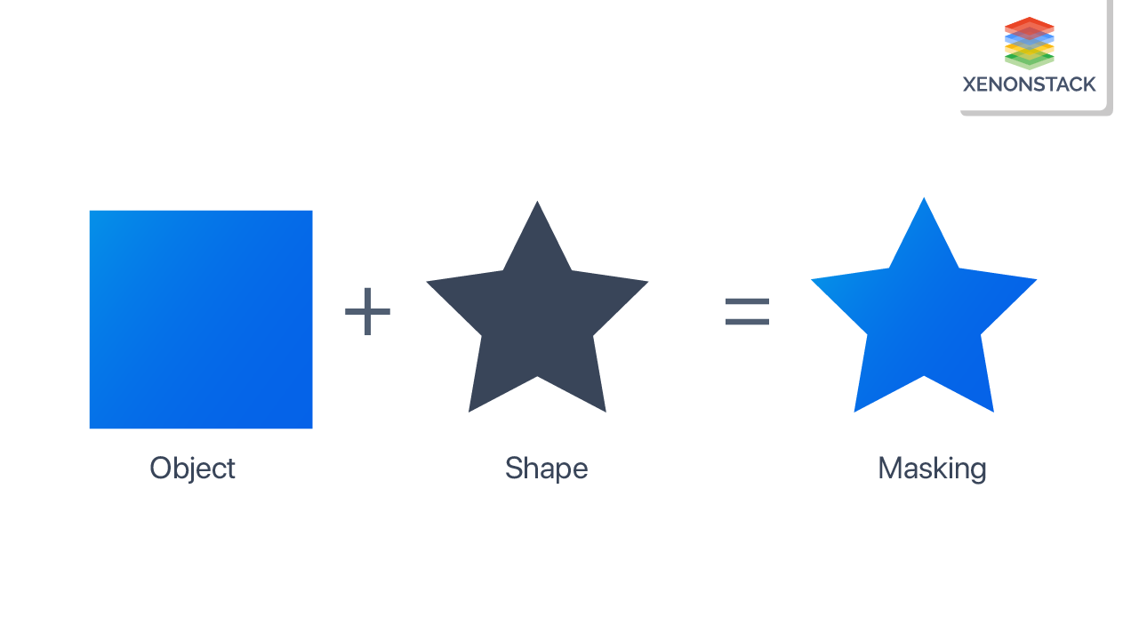
CSS masking is used to hide an image from some specific points. With the help of masking, we can hide full or partial portions of the images to produce a more visually enhanced UI.
What is masking?
CSS masking is used to hide an image from some specific points. It is done by clipping images at some specific points. Masking is used as the graphical operation to define how an image can be used as a mask by overlapping it on another image.
A graphical process that hides parts of an object or element partially or completely. Click to explore about our, CSS Mask and Clip-path
Different types of Masking?
There are two types of masks:-
Alpha
An image is a collection of pixels, and these pixels are assigned some color value. These color values have an alpha current to set the transparency in various parts of the image. Images that contain alpha channels are used as alpha masks over the other image.
- If the value of the alpha mask is zero, then the alpha mask image will overlap another image, and the bottom image will be hidden
- If the value of the alpha mask is one, then the masked image will be transparent, and the bottom image will be visible
- The masked image will be partially transparent if the alpha is between 0 and 1.
Lumiance
In the luminance mask, the value is dependent on both lumiance and alpha values. For example:- If the alpha mask value is one and the color is white, then it is visible, and on the other hand, if the color is black, it is not visible.
Different types of Mask Properties?
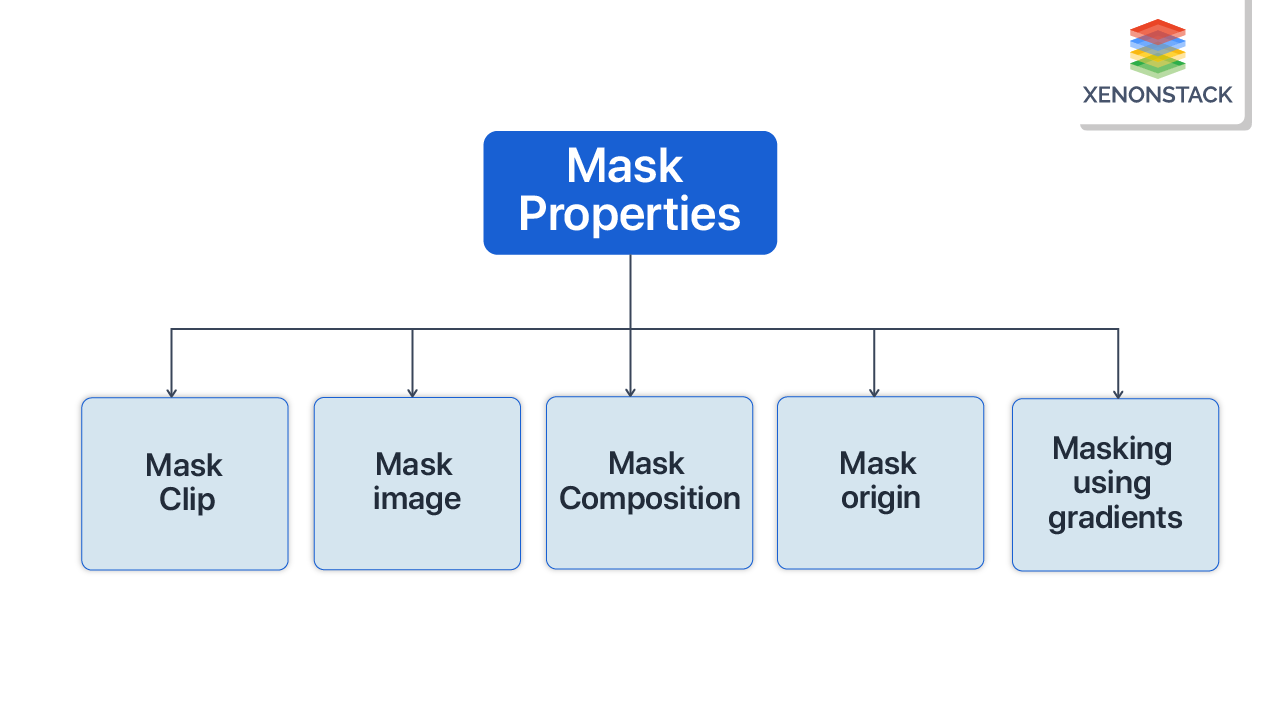
The various types of mask properties are described below:
Mask-clip
Mask- clip helps us to determine which part of the image will get affected by the mask image.
Values of mask-clip
- mask-clip: content-box:- The masked content is clipped to the content box
- Mask-clip: padding-box:- The masked content is clipped to the padding box
- Mask-clip: border-box:- The masked content is clipped to the border-box
- Mask-clip: margin-box:- The masked content is clipped to the margin box
Mask-image
Mask-image helps us to set an image that can be used as a mask image. This means that the alpha image of the masked image will be multiplied by the alpha channel of the image which is getting masked.
/* Keyword value */
mask-image: none;
/* <mask-source> value */
mask-image: url(../images/header/metasecure-logo.svg);
/* <image> values */
mask-image: linear-gradient(180deg,#3d2db2,#1f1659);
Mask Composition
Mask composite helps us define the various operations we can apply to the mask image.
/* Keyword values */
- mask-composite: add:- The masked image is placed over the image
- Mask-composite: subtract:- The masked image is placed where it falls outside the destination
- Mask-composite: intersect:- The part of the masked image which overlaps the image will replace the image from where the image is overlapping.
- Mask-composite: exclude:- The part of images which are not overlapping with each other are combined.
Mask origin
It helps to set the origin of the mask image.
/* Keyword values */
mask-origin: content-box:- The position of the masked image will be relative to the content box.
- Mask-origin: padding-box:- The position of the masked image is relative to the padding box.
- Mask-origin: border-box:- The position of the masked image is relative to the border-box.
- Mask-origin: margin-box:- The position of the masked image is relative to the margin box.
Masking using gradients
We can easily add a fade effect to our image by using gradients as a mask image.
For Example:- In the below example, the linear gradient in the balloon image goes from top to bottom.
For example:-
.mask1 { -webkit-mask-image: linear-gradient(to bottom, transparent 25%, black 75%); mask-image: linear-gradient(to bottom, transparent 25%, black 75%);}
The color, contrast, alignment, size, and font that directly impact a web page's performance. Click to explore about our, Fluid Typography Best Practices and Benefits
How to mask with text?
Masking with text is used to write text on the image to give the text a bright background or to highlight the essential text on the page. This can be achieved by masking and linear gradient in the backgrounds.
For example:-
HTML { background: linear-gradient(to left, red, orange, red); height: 90%;} div { -WebKit-mask-image: linear-gradient(to top, rgba(0, 0, 0, 0), rgba(0, 0, 0, 1)); mask-image: linear-gradient(to bottom, rgba(0, 0, 0, 0), rgba(0, 0, 0, 1));}
<div> Lorem ipsum dolor sit amet consectetur adipisicing elit. Officia itaque quod maiores similique ratione porro blanditiis, expedita illum i cumque aut fuga autem illo doloremque iusto. Ullam, voluptas!Lorem ipsum dolor sit amet consectetur adipisicing elit. Officia itaque quod maiores similique rationeporro blanditiis, expedita illum i cumque aut fuga autem illo doloremque iusto. Ullam, voluptas!</div>

Conclusion
CSS masking is a valuable feature to overlap (mask) two images, which helps to create multiple effects on images. We can mask text over images to highlight important information and linear gradients to add a fading effect on images. With fewer lines of code.
- Discover here about CSS Content Visibility Property
- Click to read about Code-Splitting in ReactJs


