Key takeaway
- CSS animations use @keyframes and animation properties to move or restyle elements. Learn the syntax, properties, performance tips and reduced motion.
A CSS animation changes an element's style over time, using a set of keyframes that define the start, the end and any waypoints, plus animation properties that control timing. It runs in the browser without script, so a few lines of CSS can draw attention to a key element or make a state change easier to follow.
This guide is for front-end developers and designers who want to use animation with purpose. It covers the syntax, every animation property, how animations differ from script-driven approaches, performance and accessibility rules, and a short list of dos and don'ts. It builds on our notes on interaction design principles and user interface design principles.
What is a CSS animation?
The MDN guide to using CSS animations says animations "consist of two components: a style describing the CSS animation and a set of keyframes that indicate the start and end states of the animation's style, as well as possible intermediate waypoints."
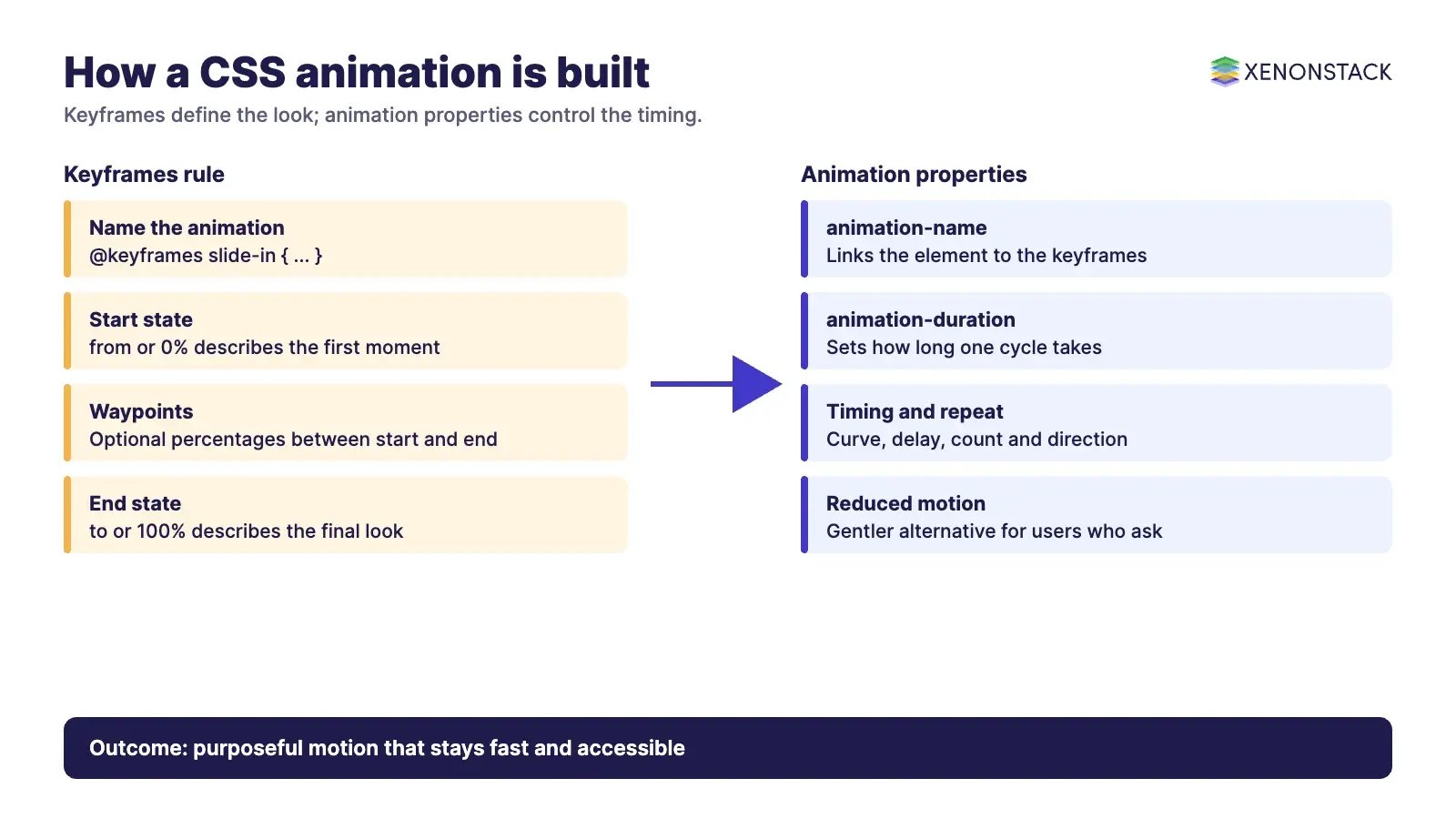
The first component, set with the animation properties, controls timing and behaviour. MDN notes that it does not configure the appearance of the animation. The second, the @keyframes rule, defines what the element looks like along the way.
How do @keyframes and animation properties work together?
Keyframes use percentages: according to MDN, 0% is the first moment of the sequence and 100% is the final state, and from and to are aliases for them. If you leave out the first or last keyframe, the browser uses the element's computed values. This example, adapted from MDN, slides a paragraph in over three seconds:
p {
  animation-duration: 3s;
  animation-name: slide-in;
}

@keyframes slide-in {
  from { translate: 150vw 0; scale: 200% 1; }
  to   { translate: 0 0;     scale: 100% 1; }
}
Two things are required in practice: an animation-name that matches a keyframes rule, and an animation-duration. The shorthand animation: 3s infinite alternate slide-in; sets duration, repeat count, direction and name in one line.
What are the CSS animation properties?
MDN lists these sub-properties of animation:
| Property | What it controls |
|---|---|
| animation-name | The name of the @keyframes rule that describes the animation |
| animation-duration | How long one cycle takes |
| animation-delay | The wait between the element loading and the animation starting |
| animation-timing-function | The acceleration curve used as the animation moves through keyframes |
| animation-iteration-count | How many times the animation repeats |
| animation-direction | Whether the first run goes forward or backward, and whether later runs alternate or reset |
| animation-fill-mode | How styles apply to the target before and after the animation runs |
| animation-play-state | Whether the animation is playing or paused |
| animation-composition | How multiple animations on the same property combine (not part of the shorthand) |
| animation-timeline | The timeline that drives the animation's progress |
Most properties accept comma-separated lists, so one element can run several animations at once. If there are fewer values than names, MDN says the values cycle back to the first.
Why use CSS animation instead of script-driven animation?
MDN names three key advantages of CSS animations over traditional script-driven techniques, and its text supports these points:
- Animations run well even under moderate system load, and the rendering engine can skip frames to stay smooth.
- Letting the browser control the sequence lets it optimise, for example by reducing the update rate in tabs that are not visible.
- You describe the result in CSS and leave the timing to the browser, which keeps the code short.
Script libraries such as Bounce.js, anime.js and mo.js still make sense when you need sequencing or control that CSS does not offer. Check each project's own documentation for what it supports before you add the weight.
How do you keep animations fast and accessible?
On performance, MDN warns that changing properties which affect the box model hurts performance, and its example animates translate and scale instead of properties such as font size. Transform properties do not affect non-replaced inline content, so set display: inline-block where needed.
On accessibility, the MDN page on prefers-reduced-motion explains that motion can trigger discomfort for people with vestibular motion disorders, and that scaling or panning large objects can be triggers. The media feature lets a user say they prefer reduced motion. MDN's example swaps a scaling animation for a gentle opacity change rather than removing animation entirely.
| Do | Do not |
|---|---|
| Animate with purpose: guide attention or explain a change | Animate everything on the page at once |
| Keep animations short | Run long loops that compete with content |
| Prefer translate, scale and opacity | Animate properties that change layout |
| Provide a prefers-reduced-motion alternative | Ignore the user's motion setting |
| Preview after each small change | Stack many effects before testing |
How do AI agents change front-end animation work?
Agents can draft keyframes from a design description, then check the result against rules a team cares about: whether a reduced-motion alternative exists, whether layout properties are being animated, and whether an effect plays on every page. The designer still decides what is worth animating. For teams automating front-end checks and testing like this, ElixirClaw, the AI agents computing platform, is the product to look at.
What should you do first?
- Pick one element where motion explains a change, not decoration.
- Write the keyframes with transform and opacity properties.
- Set a short duration and a timing function, then preview it.
- Add a prefers-reduced-motion rule before you ship.
- Review your page structure so animation supports the hierarchy.
Related reading: service blueprint benefits and elements, behavioural design patterns, human-centred design principles, user experience design tools and our digital product development services.
To map one decision your front-end automation agents make, and the data and policy it depends on, book a Context Workshop. See what happens in the workshop.
Frequently asked questions
What is the difference between a CSS animation and a transition?
A transition moves between two states when a property changes, while an animation uses keyframes that can include waypoints and repeats. Use a transition when you only need a simple change.
What does @keyframes do?
It defines the stages of an animation using percentages or the from and to keywords, so the browser knows what the element looks like at each point.
Which animation properties are required?
You need an animation-name that matches a keyframes rule and an animation-duration. The other properties adjust delay, repeat count, direction and more.
How do I respect users who prefer reduced motion?
Use the prefers-reduced-motion media feature to replace large scaling or panning with a gentler effect such as a fade, or to remove the motion.
Why animate transform instead of width or margin?
Changing properties that affect the box model hurts performance, so animating translate and scale is the safer choice.
Ready to put AI agents to work? See an ElixirClaw demo: the agentic OS to build, orchestrate and govern AI agents across your enterprise systems.
Explore the XenonStack platform family: ElixirData · ElixirClaw · ElixirHub · NexaStack · MetaSecure · Neural AI · AgentGRC · AgentSRE · AgentAnalyst · AgentInstruct · AgentRAI · AgentScrum · AgentSearch · AgentForce · AI Aviator · SAIF Aviator · CohortIQ · XenonStack AI · XenonStack UAE