
.webp?width=1921&height=622&name=usecase-banner%20(1).webp)
Introduction to Responsive Web Design
Responsive web design (RWD) is a modern web design approach that creates dynamic changes to the appearance of a website and adjusts the content of websites and webpages to automatically render (or display) on all devices or screen sizes, whether it's a desktop, laptop, tablet, or smartphone and provides an optimal viewing experience. RWD mainly uses fluid grids, CSS styling, flexible images, media queries, etc., to determine the size and orientation of the screen on which it is viewed and then adjusts the layout to fit best as per the browser's width or width screen.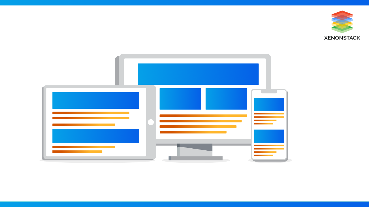
An open source layout and functional testing framework for websites, written in Java, to test the look and feel of responsive websites. Click to explore about, Responsive Design Testing with Galen Framework
Why Responsive Web Design is essential?
Responsive web design alleviates the pain of web designers, UI designers, and web developers working day and night creating websites for every single different device that exists.
If we design and develop countless versions of a website that works for every known device out there, the process wouldn't be practical time-wise but would be highly costly. It would also lead sites to ineffective future technology changes and make them nearly impossible to maintain. Knowing the audience and what device they're using to browse the website is another important key to responsive web design.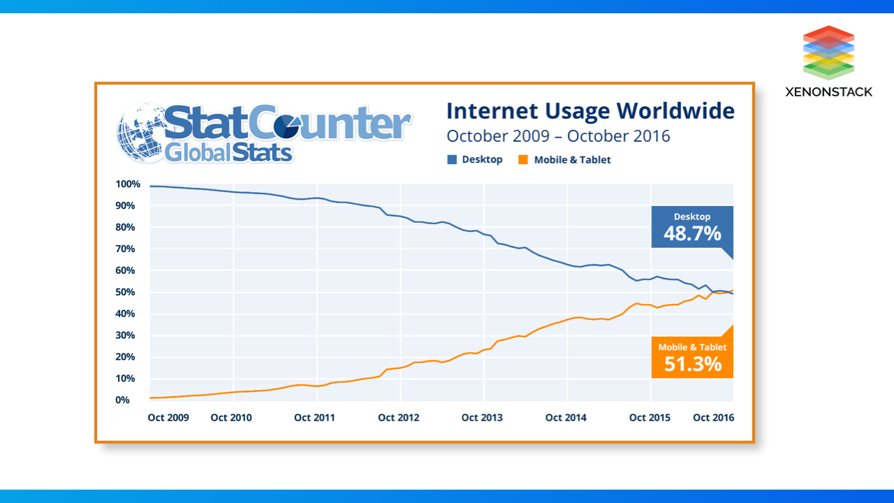
According to research is done in 2016, approximately 48.7% of internet usage worldwide was done by desktops, while 51.3% usage was registered by mobile and tablet. This was an alarm for many professionals, sole traders, and various businesses to make their websites mobile-friendly. A mobile-friendly website design or, more precisely, Responsive web design was the only optimized way to gain the appreciation and loyalty of an explosively increasing number of users of mobile devices.
We live in a multi-screen world, and it's wise to appeal to both desktop and mobile viewers, and this number will continue to rise as smartphone accessibility increases globally. 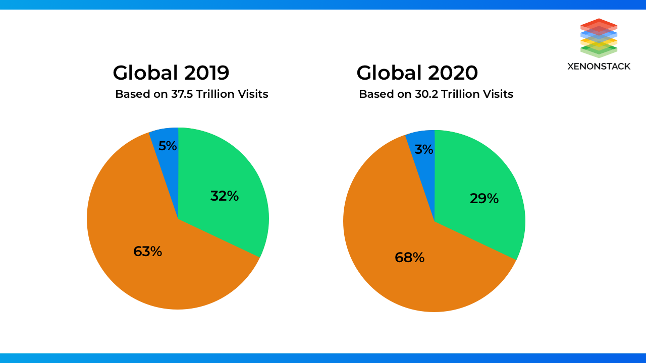
According to research done in 2020, 68.1% of all website visits 2020 came from mobile devices (Globally) — an increase from 63.3% in 2019. 28.9% of visits came from Desktops, while 3.1% of visitors came from tablets.
What are the Importance of Responsive Web Design?
- Responsive web design is an excellent web design approach as it provides Cost-efficient, Flexibility, increased user experience, Search engine optimization, and Ease of management.
- Ranking Factor also depends on Responsive web design and mobile-first indexing. Responsive sites will generally load faster, which leads to boost our ranking and reduce our bounce rate.
- Responsive web design can also make social sharing easier, helping us grow a bigger audience for our brand.
- Responsive web design SEO campaigns and website maintenance are easy to maintain with a smooth process with a mobile-friendly website. Using responsive web design, we only have one website to maintain.
Before you start coding, consider these fundamental design concepts for building clean, efficient interfaces for a broad set of users. Click to explore about, UI Design Dos and Don’ts
How Responsive Design Works?
Responsive design is the best way to optimize the display of a web page for multiple devices with a single piece of source code. This allows us to create similar experiences for the users across different devices.
There are three main technical aspects through which we can achieve the responsive web design:
- Fluid Grids
- Flexible Media
- Media Queries
The spanning CSS media feature can be used to test whether the output device is a dual-screen and the browser viewport is spanned across the two display regions. Click to explore about, CSS media screen-spanning
Fluid Grids
A grid is a division of the page layout in vertical and horizontal guidelines. Grid Layout has a two-dimensional layout system, which controls the layout in rows and columns.
For the layout-first approach, Grid is also a great choice. CSS Grid brings in multiple properties that allow us to create grid containers and control the alignment and sizing of grid elements using CSS.
In adaptive grids, we define pixel-based dimensions. Hence we have to adjust the heights and widths manually in specific device viewports. We should only do limited adjustments that are going to be required for different screen sizes and devices as fluid grids flow naturally within the size of their parent container.
Mobile devices are becoming smaller in size, and users prefer using them in their work. On the opposite hand, desktop monitors are becoming wider with higher resolutions. Hence, we shouldn't just plan for smaller devices in responsive design. The primary benefit of a fluid grid is that we will change the max-width, and it will still work on larger screens thanks to the percentage-based calculations.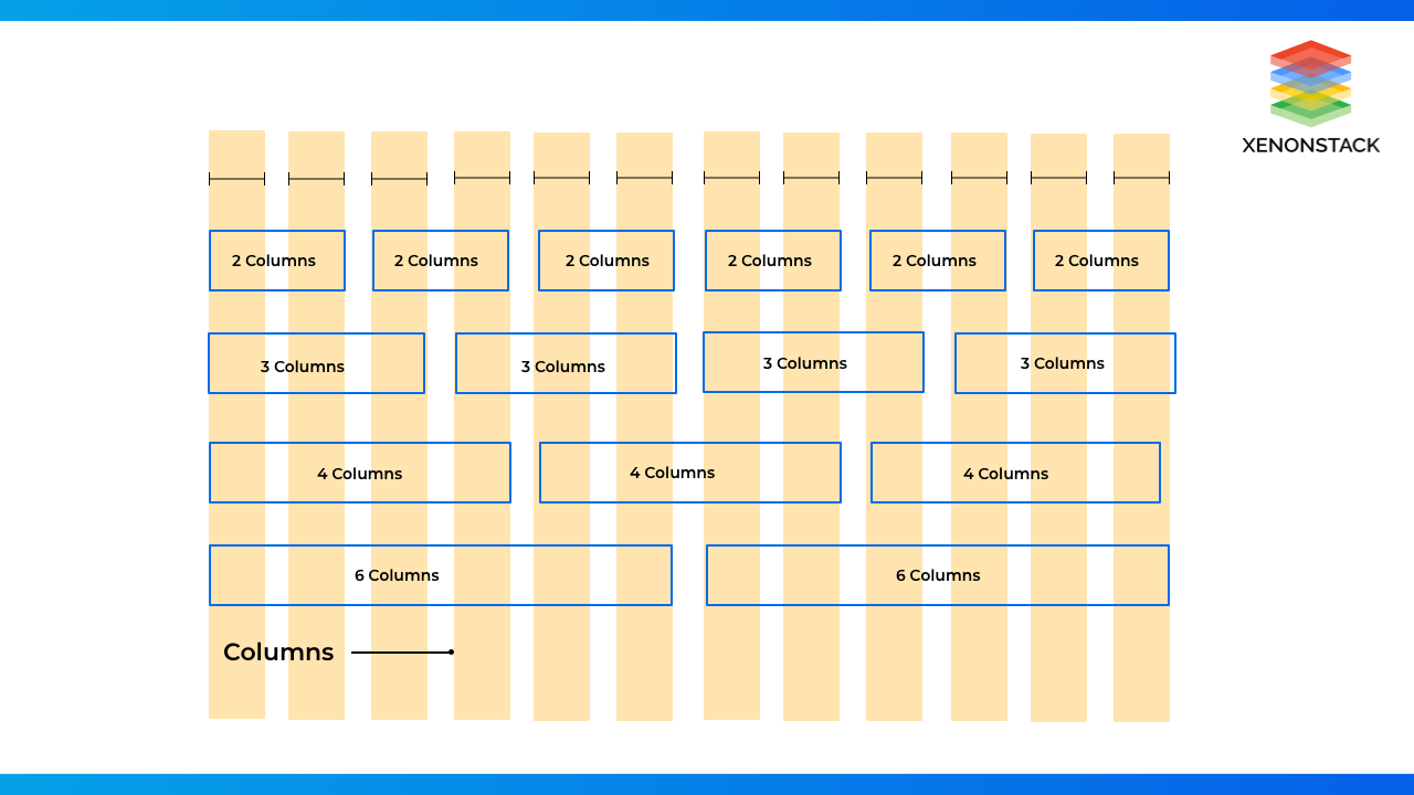
In xenonstack, we use a 12 column grid system for a responsive design where we divide the screen size into three categories lg - for desktop screen size, md - for laptop and tablet screen size, and sm - for mobile screen size. The space between the columns is known as gutter, and we wrap all the columns in a single container.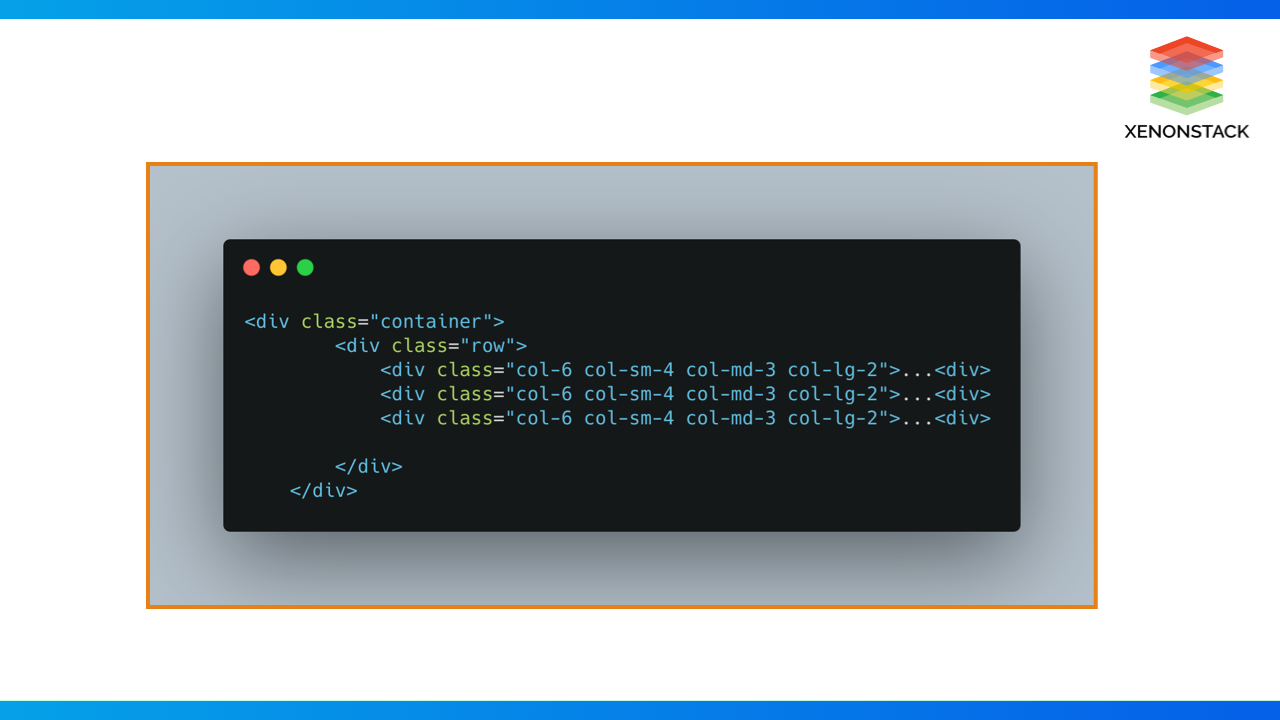
Flexible Media
The second important part of responsive web design is to design media that adapt to the browsing environment. Some of the items on the page may have to be resized or hide from the display completely for specific devices.
Fluid Images
Images remain the same size and orientation at all viewport configurations as they are not naturally fluid-like web page text, and they get cropped if they become too large for their container. For responsiveness for an image, we should use size images in relative units rather than absolute pixel dimensions. The best relative unit for images is to set the max-width 100% of the image.
The max-width 100% fluid image technique is excellent for header images and "hero" images.
Resolution switching: Different sizes
We can use srcset and sizes to provide several additional source images and hints to help the browser pick the right one.
Creating a responsive web design may seem confusing at first, but knowing a few of the UI design trends is a great way to get inspired and learn. Click to explore about, Responsive User Interface Design Trends
CSS Box Model
CSS Box Model used to create the layout and design of web pages. Understanding the CSS box model is required for rendering content as it is a type of container which includes many properties like margin, padding, borders, and the content itself. According to the CSS box model, every element rendered in a web browser looks like a rectangular box. It's also a toolkit for customizing the layout of different elements.
Box-Model has multiple properties in CSS. Some of them are given below:
- Borders
- Margins
- Padding
- Content
CSS Units
Understanding the CSS units is essential to defining font size and width height of elements.
Absolute Length Units: Many absolute length units are not relative to anything else and are always considered always to be the same size, which are as follows -
|
cm (Centimeters) |
mm(Millimeters) |
Q (Quarter-millimeters) |
in (Inches) |
|
pc(Picas) |
pt(Points) |
px(Pixels) |
Many of these units are only used when we use them for print instead of screen output. For example, we generally don't use cm (centimeters) on the screen. The only value which we will use is px (pixels).
Relative Length Units
Relative length units are always close to the parent's elements or the size of the viewport. Relative units mean that we can scale up and down using relative values according to some other value.
|
em |
em relative units always depend on parent font size, it will scale up and down according to parent’s container value |
|
ex |
x-height of the element's font. |
|
ch |
It’s always based on “0” character Relative to width of the "0" (zero) |
|
rem |
Font size of the root element. |
|
lh |
Line height of the element. |
|
vw |
1% of the viewport's width. |
|
vh |
1% of the viewport's height. |
|
vmin |
1% of the viewport's smaller dimension. |
|
vmax |
1% of the viewport's larger dimension. |
Media Queries
Fluid grids don't resolve all of the problems raised by the increasing number of screen sizes, and we use media queries. Media Queries is a CSS3 module that helps design responsive websites by defining different style rules for other devices or media types. Based on media rules, content is displayed to adapt to varied conditions, such as screen sizes, browser window sizes, device sizes, orientation, and window resolution.
Media Query Syntax
The first part of a media query recipe is the @media rule itself.
The second part of a media query is media types which describe the general category of a device. all print, screen, speech
The third part is media features that describe the user agent's specific characteristics, output device, or environment. Media features include device screen width range. Parentheses should compulsorily surround every media feature expression.
The fourth and final part is The logical operators not, which can be used to compose a complex media query. We can also use commas as separators to combine multiple media queries into a single rule.
Syntax of a media query is always the same in all the scenarios, no matter if we use it inside a head tag link element, using @import instruction, or in a CSS style sheet. We can insert CSS media queries in HTML pages in the following ways:
- Inserted into an <link> element, which refers to a CSS style sheet.
- Inserted before an @import CSS instruction in CSS style sheet.
- Inserted inside a CSS style sheet.

This example shows how to add media queries to a link element in the head tag of an HTML document. To apply the CSS file to the HTML document, the conditions in the media query should satisfy.
This example shows how to import a CSS stylesheet from within another CSS style sheet. We can attach a media query to the @import keywords. If the conditions in the media query are matched only, then the CSS file is imported and applied.
The above example shows how we can insert media queries into a CSS style sheet directly. It will run only when the conditions in the media query match and the CSS rules inside the media query block are applied.
An example of a responsive design that follows all defined term is XenonStack
Conclusion
Responsive Web design is the approach that suggests that design and development should respond to the user’s behavior and environment based on screen size, platform, and orientation.
- Discover more about Building Scalable and Responsive Applications
- Click To explore about Design Thinking for Agile User Stories
- Basic Principles for Best Conversational User Interfaces


