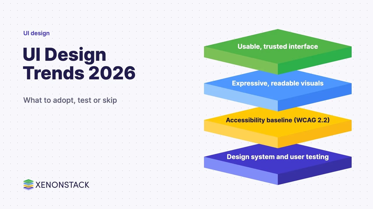
Key takeaway
- Which UI design trends matter in 2027? Checked against Material 3 Expressive, Apple Liquid Glass, WCAG 2.2 and NN/g, with advice for enterprise teams.
What are the UI design trends that matter going into 2027?
The trends worth adopting in 2026 are the ones that help people finish tasks: expressive but readable visual systems, translucent layers used with restraint, accessibility built in from the start, and interfaces that explain what AI features are doing. Pure style trends such as brutalism, aurora backgrounds and bold type are a matter of taste, and the evidence for them is thinner.
These trends are checked against Material Design, Apple's Human Interface Guidelines, Nielsen Norman Group (NN/g) and W3C. This guide is written for product, design and engineering leaders who set the standards a team builds to. For the foundations, see our guide to the principles of user interface design.
What is user interface design, and which types of interface exist?
User interface (UI) design is the work of shaping what people see and touch on a screen or device so they can act without confusion. It covers graphical, command line, menu-driven, touch, voice and form-based interfaces, and increasingly conversational and AI-mediated ones.
| Interface type | How people interact | Typical example |
|---|---|---|
| Graphical (GUI) | Icons, windows and controls | Desktop and web applications |
| Command line (CLI) | Typed commands | Pushing code to a repository from a terminal |
| Menu-driven | Choosing from lists of options | Cash machines and kiosks |
| Touch | Taps and gestures | Smartphones and tablets |
| Voice (VUI) | Spoken commands | Voice assistants |
| Form-based | Filling in fields | Sign-up and checkout flows |
| Conversational and AI-mediated | Text or voice with an assistant or agent | In-product assistants |
Conversational interfaces have their own rules; see our guide to conversational user interface best practices. UI is also one half of the wider discipline covered in user experience design.
Which UI design trends are worth following going into 2027?
| Trend | What the source says | How to use it | Status |
|---|---|---|---|
| Expressive design systems | Google's design research page describes Material 3 Expressive as using colour, shape, size, motion and containment, drawing on 46 studies and more than 18,000 participants | Use it where it speeds up finding key elements, and keep familiar patterns for core tasks | Current Material direction; check m3.material.io for components |
| Liquid Glass and translucent layers | Apple's HIG says Liquid Glass is a functional layer for controls and navigation and should not be used in the content layer | Limit it to a few important controls; test legibility | Current on Apple platforms (HIG guidance added 9 June 2025, updated 9 September 2025) |
| Dark mode as a choice | NN/g does not recommend dark mode by default but strongly recommends letting users switch | Offer both themes and follow the system setting | Established expectation |
| Accessibility as baseline | WCAG 2.2 is a W3C Recommendation (12 December 2024) | Design to WCAG 2.2 AA, including target size and focus visibility | Standard |
| Reduced motion and motion with purpose | MDN: prefers-reduced-motion is widely available since January 2020 | Honour the setting for animated effects | Standard |
| AI-mediated interfaces | NN/g State of UX 2026 calls trust a major design problem for AI experiences | Show what the assistant did, give control, handle failure | Fast-moving; test with users |
Material 3 Expressive
According to Google's design research page, Material 3 Expressive grew out of research that began in 2022. Google reports that participants spotted key interface elements up to four times faster in the expressive designs, and that well-applied expressive design was strongly preferred across age groups. The same page is careful to add that "no amount of expressive design will beat basic functionality", and that a redesign which dropped familiar patterns scored lower on usability. Treat it as a way to make important actions easier to find, not as decoration.
Liquid Glass, glassmorphism and legibility
Translucent interfaces remain popular, but readability is the risk. NN/g warns that glassmorphism can create significant accessibility and usability problems, because text can cross several background colours and contrast can be adequate in one area and poor in another. Apple's guidance points the same way: use Liquid Glass sparingly in custom controls, use the regular variant where components carry a lot of text, and consider a dimming layer behind clear Liquid Glass over bright content. Both sources say to give people a way to reduce transparency or raise contrast.
Dark mode
NN/g's review of the research found that for people with normal vision light mode usually performs better, and that the advantage grows as text gets smaller. Dark mode can help some users, for example people with cloudy ocular media, and suits long reading sessions. The practical rule is to offer both and let people choose.
Minimalism, typography and storytelling
Restrained layouts, clear type and a visible narrative remain sound habits, but they are design judgement rather than measured findings. NN/g's State of UX 2026 (16 January 2026) argues that surface-level design alone will not keep a product competitive, because design systems and AI tools make decent-looking interfaces easy to produce.
Mobile first
Designing small screens first is still a good constraint for prioritising content. This guide does not quote a mobile traffic share, because the share varies by product and audience; check your own analytics.
How should enterprise teams govern UI trends?
Trends become risk when they bypass standards. A simple sequence keeps them useful: set accessibility and contrast requirements first (WCAG 2.2 AA), define components in a design system, trial a trend on one journey with real users, and extend it only if task success holds. WCAG 2.2 Target Size (Minimum) asks for pointer targets of at least 24 by 24 CSS pixels, with five exceptions including spacing and inline links, so check it in review. Interfaces that let an AI assistant or agent act for the user need extra care: NN/g names transparency, control, consistency and support when the system fails as the basics of trust.
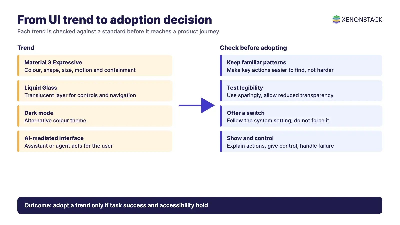
Where agents act through the interface, the decision layer behind it matters as much as the screen. ElixirClaw is described on its site as an agentic OS platform for building, orchestrating and governing AI agents, and ElixirData Context OS keeps governed context, versioned policy and decision traces in one decision layer above AI agents.
When should you not follow a UI trend?
Skip a trend when it lowers contrast or text size on dense, task-heavy screens, when it removes familiar patterns from a core flow, when it cannot be tested with the people who use the product, or when it adds motion that you cannot switch off for people who ask for reduced motion. A trend that fails these checks is a style choice, not an improvement.
To map one AI-assisted interface decision your agents should make, and the context and policy it depends on, book a Context Workshop. See what happens in the workshop.
What should you plan for in 2027?
A trend is worth carrying into the next year only if it helps people finish tasks. Plan your design standards around these points.
- Set accessibility and contrast requirements first, to WCAG 2.2 AA, before any visual trend is adopted.
- Trial each trend on one journey with real users, and extend it only if task success holds.
- Keep familiar patterns in core flows, offer both light and dark themes, and honour the reduced motion setting.
- Where an AI assistant or agent acts for the user, show what it did and give people control.
Review each trend against these checks every time your design system is updated.
Frequently asked questions
What are the main UI design trends going into 2027?
Four themes stand out in the sources checked: expressive but usable visual systems such as Material 3 Expressive, translucent layers such as Apple's Liquid Glass used sparingly, accessibility as a baseline (WCAG 2.2), and AI-mediated interfaces where trust and control matter more than surface polish.
Is dark mode still a trend, and should it be the default?
Dark mode is now an expected option. Nielsen Norman Group reviewed the research and does not recommend dark mode as the default for the general population, because light mode usually performs better for people with normal vision, but it strongly recommends letting users switch.
What is Liquid Glass and when should it be used?
Liquid Glass is Apple's dynamic material for controls and navigation that float above content. According to Apple's Human Interface Guidelines, it should not be used in the content layer and should be applied sparingly to custom controls.
What changed in WCAG 2.2 that affects UI design?
WCAG 2.2 became a W3C Recommendation on 12 December 2024. It added nine success criteria, including Target Size (Minimum) at level AA, which asks for pointer targets of at least 24 by 24 CSS pixels unless an exception applies, and it removed 4.1.1 Parsing.
Do UI trends still help a product stand out?
Less than before. Nielsen Norman Group's State of UX 2026 says design systems and AI tools make decent-looking interfaces easy to produce, so judgement, research and trust in AI features carry more of the value.
Related reading: principles for human-centred design.
Sources: Google Design, expressive design research; Apple Human Interface Guidelines, Materials; NN/g, Dark mode; NN/g, Glassmorphism; NN/g, State of UX 2026; W3C, WCAG 2.2; W3C, Target Size (Minimum); MDN, prefers-reduced-motion.
Explore the XenonStack platform family: ElixirData · ElixirClaw · ElixirHub · NexaStack · MetaSecure · Neural AI · AgentGRC · AgentSRE · AgentAnalyst · AgentInstruct · AgentRAI · AgentScrum · AgentSearch · AgentForce · AI Aviator · SAIF Aviator · CohortIQ · XenonStack AI · XenonStack UAE