
.webp?width=1921&height=622&name=usecase-banner%20(1).webp)
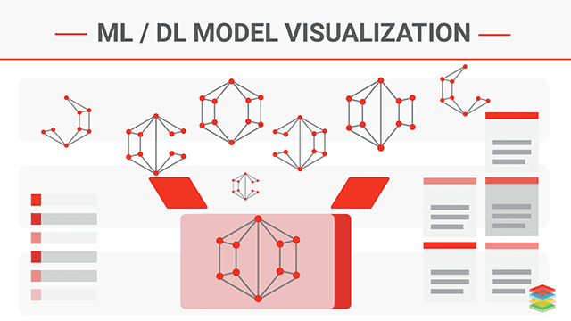
What is Model Visualization?
Model Visualization provides reason and logic behind to enable the accountability and transparency on the model. Machine Learning models considered as Black Box Models due to complex inner workings. Data Scientists deliver a model with high accuracy. There are some scenarios where models cannot be explained to the public because the system may hack.
Data Visualization Techniques uses charts and graphs to visualize large amounts of complex data. Click to explore about, Advanced Data Visualization Techniques and its Features
Different types of Model Visualization are are described below:
- Data exploration - Data exploration is done using exploratory data analysis (EDA). Apply T-distributed Stochastic Neighbour Embedding (t-SNE) or principal component analysis (PCA) techniques to understand the feature.
- Built models - Various metric to measure classification and regression model. Accuracy, precision and recall, confusion metrics, log loss and F1 score used in classification while meaning squared error (MSE), mean squared logarithmic error, root mean square error(RMSE) used in the regression. All these metrics after built model are used to understand and measure the performance.
- Decision Tree models - Static feature summary such as feature importance retrieved from the model. It only exists in Decision tree-based algorithms such as Random Forest and XGBoost.
- Evaluate Model - Evaluate model's mispredictions.
Model Visualization during Training
During the training of models, it is necessary to visualize the training process and helps to understand debug models and track errors and progress of the models. Visualize the test and train result values at each step.
- Scalars( Loss and Accuracy) - Scalar can be used to show the trends of error during training. Besides logging the loss and accuracy to the stdout regularly, we record and plot them to analyze its long-term trend.
- Histograms - Visualize how the distribution of tensors in the model graph has changed over time. Showing many histograms visualizations of tensor at different points in time.
- Weight and bias -Monitor the weights and the biases during training time by visualizing them on histograms.
- Activation - For gradient descent to perform the best, the node outputs before the activation functions usually distributed.
- Gradients - Gradients can be visualized for each layer to identify deep learning problems like gradient diminishing or exploding problems.
- Graphs -Graphs visualize the internal structure or architecture of the model.
- Image -Images at each step of training means intermediate images generated can be visualized and visualize tensors.
- Projector - Visualize the principal component analysis and t-sne algorithm model results. This technique mainly uses for dimensionality reduction.
Data Viz or Data Visualization is the graphical representation of data and information. Click to explore about, Top Ten Data Visualization Tools
Why Model Visualization is Importnat?
The only accuracy will not give the exact interpretation of the model. Test model accuracy and trust that the classifier or model is working correctly.
- Proper explanations of what the model is doing?
- Why the results are what they are?
- Output in a form or visual form described to the non-technical persons.
Example of Developing Machine Learning models
DevelopMachine Learning modelsfor medical diagnostics purpose, only high accuracies or fewer errors on test samples may not be enough to sell them to clinicians. Doctors and patients alike will be less inclined to trust a decision made by a model they do not understand.
We need to explain in most of the scenario because -
- Trustability -If the classification or prediction result used, need some domain knowledge like a stock trader to understand to provide the decision to buy or sell a particular stock.
- Transparency - Machine learning cannot be a Black Box and should provide the model structure, clarity to the client, consumer, and management. Just like open-source, models understanding should be open source.
- Accountability - Model should have accountability to provide a correct answer to the consumer. As a model owner, we should validate model features to guarantee its help in making a decision.
How Model Visualization works?
Classification/Regression Machine Learning model results or decisions are difficult to understand by human brains. It also makes it difficult to explain to the non-data-scientists. The complex model functionality can be approximated by locally fit the linear models to some permutations of the training set.
LIME (Local Interpretable Model agnostic Explanations)
LIME is an algorithm to explain the predictions of the classifier or regression model. It gives the list of features with visual explanations, features importance in visual form is needed to determine essential elements in the dataset. LIME provide visual descriptions of the model and explains what the actual model is implementing.
Example for Model Prediction
A model predicts that a specific patient has the flu. The prediction is then explained by an explainer that highlights the symptoms that are important to the model. With the help of this information about the rationale behind the model, the doctor is now empowered to trust the model or not.
GradCAM (Gradient-weighted Class Activation Maps)
Gradient-weighted Class Activation Maps is an advanced and specialized method. Some constraints of this method are that we need to have access to the internals of the model, and it should work with images. For a simple understanding of the method, given a sample of data(image), it will give the output in the form of a heat map of the regions of the image where the neural network had the most and greatest activations, therefore the features in the image that model correlates with class.
SHAP (Shapley Additive Explanations)
SHAP provides many explainers for different kinds of models.
- Tree Explainer - Supports XGBoost, LightGBM, CatBoost, and scikit learn models by Tree SHAP.
- Deep Explainer(DEEP SHAP) - Support Tensorflow and Keras models by using Deeplift and Shapley values.
- Gradient Explainer - Support Tensorflow and Keras models.
- Kernel Explainer (kernel SHAP) - Applying to any models by using LIME and Shapley values.
The process of analyzing the data objects and their relationship to the other objects. Click to explore about, Data Modelling Tools and Techniques
Decision Trees Visualization
Decision tree Models can be visualized or interpret easily with the help of decision trees. It allows browsing through each of the individual trees to see their relative importance to the overall model. Answer the question as what can be the importance of each feature to a particular tree.
Below unique visualization characteristics
- The decision nodes show how the feature space split.
- The split positions for decision nodes are shown visually in the distribution.
- In the models, it visualized how the training data or samples gets distributed in leaf nodes and how the tree makes predictions for a specific observation.
Model Structure Visualization
- Understanding Neural Networks Through Deep Visualization.
- Display each layer, activations, weights.
Visualization of the behavior of Neural Networks
Visualization ofArtificial Neural Networks is in the form of static node-link diagrams, which visualize the structure of a network, rather than the action of the model.
Visualization of neural networks trained digit recognition, showing the actual behavior of the network given user-provided input. The user interacts with the network through a drawing pad and watches the activation patterns of the network in Real-Time.
How to adopt Model Visualization?
Model Visualization can be adopt with:
Visualization during Training
Visualizing model during the time will provide the easy indication of tuning hyperparameters for providing more accuracy and less error rate. For example, GAN(generative adversarial networks) during training visualization will show a GAN model which learns the distribution of points in two dimensions. The distributions in two-dimensional space are more comfortable to visualize than distributions in the space of high-resolution images. Firstly choose a probability or data distribution for GAN to learn, which visualizes as a set of data samples. Select data distribution, shown at two places smaller version model overview graph and larger versions in the layered distributions. The model overview graph will show the architecture of the GAN. Layered distributions view will show the visualizations of the components from the model overview graph, can compare the component outputs.Debugging during Visualization
Model visualization will provide the view of internal structure and state of running TensorFlow graphs during training and inference, difficult to debug with general-purpose debuggers.3-D Dimensional data which provides the perception of depth, breadth, and height. Click to explore about, Multidimensional Data Visualization
What are the benefits of Model Visualization?
- It is necessary to understand how all these algorithms are making decisions.
- Recognizing the essential features of a model gives us insights into its internal workings and offers directions for removing bias and improving its performance.
- It also helps to debug models.
- Mostly the reason for providing explanations with the predictions is that explainable ML models are necessary to gain end users trust.
Model Visualization Tools
Neural Networks Visualization
- CNNVis - Provides better analysis of Deep Convolutional Neural Networks.
- Neural Networks Playground -An interactive in-browser visualization of Neural Networks.TensorFlow playgrounds involve interactive visualization of Neural Networks.
- Neutron - Neutron gives the visualization for Deep Learning and Machine Learning Models.
- ANN visualizer
Tools for data exploration
Tools for explaining Predictions
- SHAP (Shapley Additive Explanations)
- LIME (Local Interpretable Model agnostic Explanations)
Tools for Visualizing during Training
- Visual DL- VisualDL is a profound learning visualization tool that can help in visualize Deep Learning jobs including features such as scalar, parameter distribution, model structure, and image visualization.
- TensorBoard- It allows to visualize the model structure, plot quantitative metrics about the execution of the model, and show additional information data like images, audio, text that pass through it.
Tools for Evaluation Visualization
- Yellowbrick- Yellowbrick comprised of visual diagnostic tools called visualizers that extend the Scikit-learn API to allow human steering of the model selection process.
Some visualizers are -
Feature Visualization, Classification Visualization, Clustering Visualization, Regression Visualization, and Model Selection Visualizations.

Concluding Model Visualization
A holistic approach to model visualization is to build transparent and accurate deep learning visualize the model. It gives accurate data to perform further actions on it. It helps to perform and getting to know about the dataset that can help with identifying patterns, corrupt data, outliers, and many more. To know more, you are advised to look into the below steps:
- Learn more about "Machine Learning Platform for Training, Validation and Serving"
- Explore How to build "Continuous Delivery of Machine Learning Pipeline"
- Know more about "Machine Learning Models Deployment with Tensorflow 2.0"


