
.webp?width=1921&height=622&name=usecase-banner%20(1).webp)
Introduction Responsive Design
Today, when we talked about the term: "responsive design," the first thought that came to our mind was using media queries to change layout when resizing a design from desktop size to tablet size to mobile size. But shortly, this insight of responsive design could also be considered outdated using tables for page layout.
CSS is near revolutionizing the concept of responsive design by adding some new queries. These will directly magnify the component-based design landscape. Component-driven development has become a really popular development strategy.
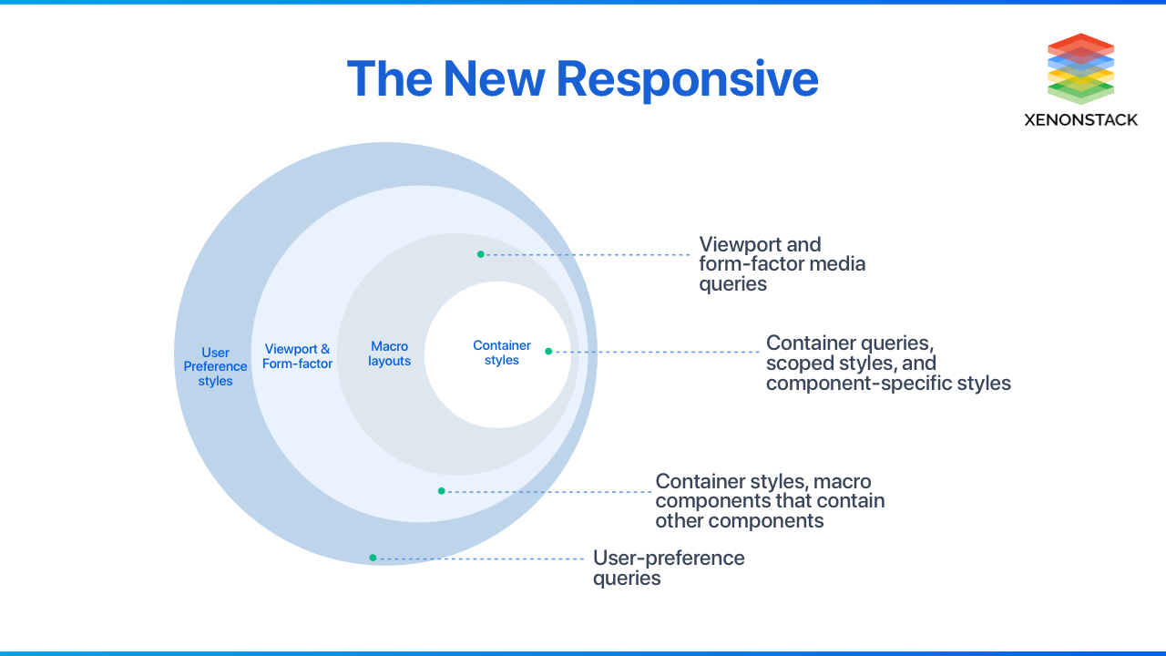
The New Responsive Component-Driven Responsive Design contains updates to include container queries, media features based on user preference, and media queries for new screen types, such as a foldable screen. We will go through these components one by one in this blog. Component-based design systems produce inherent efficiencies for designers and developers and solve the challenges related to duplication and inconsistency in applying themes while driving the event of higher quality, reusable components.
An open source layout and functional testing framework for websites, written in Java, to test the look and feel of responsive websites. Click to explore about, Responsive Design Testing with Galen Framework
Media Features based on User-Preference
The media features based on user preference are one of the most rousing upcoming CSS features. It allows us to build more accessible and tailored experiences to accommodate different user needs. Many of these media features aren't fully supported across browsers, but it shouldn't restrict us from using them. If they aren't supported within the user's browser, they'll just be ignored. According to written in w3.org spec, there are 6 different user preference media features, which are:
- Prefers-reduced-motion
- Prefers-reduced-transparency
- Prefers-contrast
- Prefers-color-scheme
- Forced-colours
- Prefers-reduced-data
Preference features are acquired based on user's preferences in their OS(Windows, macOS, Linux) and help develop a more robust and personalized web experience, especially for those with accessibility needs.
Before you start coding, consider these fundamental design concepts for building clean, efficient interfaces for a broad set of users. Click to explore about, UI Design Dos and Don’ts
Control motion on the page using the prefers-reduced-motion feature
Users who have set OS preferences for the reduced motion because [ people with cognitive concerns such as Attention Deficit Hyperactivity Disorder (ADHD) ] generally request fewer animations when using their computer.
That's why it's likely that they might not appreciate a flashy intro screen, card flip animation, intricate loader, or other flashy animations while using the web.
With preferred-reduced-motion, you'll design your pages with reduced-motion in mind and make a motion-enhanced experience for those that do not have this preference set.
@media (prefers-reduced-motion: reduce){/* User which prefer less animation and motion */}
@media (prefers-reduced-motion: no-preference){/* User which have no preference set in OS */}
Increased or Decreased contrast using the Prefers-Contrast
Some users pick to have less or more contrast between elements. The prefers-contrast media feature will be used to detect if the user has requested less or more contrast.
@media (prefers-contrast: low){/* User which prefer less contrast */}
@media (prefers-contrast: no-preference){/* User which have no preference set in OS */}
Using prefers-color-scheme for Light and Dark version
This is probably the foremost well-known property of all of the user preference media features.
The prefers-color-scheme feature helps you to customize your user interface to the theme which your user prefers. In their OS, whether it's on desktop or mobile, users can set a preference for light, dark, or auto themes, which change depending on the time of day.
@media (prefers-color-scheme: dark){/* User which prefer dark theme */}
@media (prefers-color-scheme: light){/* User which prefer light theme */}
Using prefers-reduced-data for fewer data to be used on user request
The reduced data media feature can serve lighter CSS, which will use less data on page load. We can use it to show lighter background images, remove animations, not loading custom fonts, and much more.
@media (prefers-reduced-data: no preference){/* User which like no preference set in OS */}
@media (prefers-reduced-data: reduce){/* User which prefer less data */}
No-preference value is the default option, similarly to other media features, that the user hasn't specified whether they want reduced data or not.
The spanning CSS media feature can be used to test whether the output device is a dual-screen and the browser viewport is spanned across the two display regions. Click to explore about, CSS media screen-spanning
CSS - A Container Queries
While developing a responsive design, we use a media query to change the document layout based on the viewport's size. When we target the element, we decide that when the children are within the sidebar, it should use the stacked layout. In terms of obtainable space, however, it may well be that the object in the sidebar would have enough space to display in the side-by-side layout on large screens.
This problem is resolved by container queries where, rather than looking at the viewport size, we measure the container size and make website layout adjustments according to the space in the container.
Warning: The CSS container queries are only supported in the experiment flag using Chrome Canary for now.
.parent {contain: layout inline-size/block-size;}@container (max-width: 850px) {.child img {display: none;}.child p {font-size: 1.25rem;}}
We can now test it with container queries Chrome canary (Canary is a version of the Chrome browser released daily and automatically for the Mac and Windows platforms. It's a test release before the new production release (Version prior to Chrome release). To begin with, search in chrome tab chrome://flags and look for "container queries," then enable it.
Creating a responsive web design may seem confusing at first, but knowing a few of the UI design trends is a great way to get inspired and learn. Click to explore about, Responsive User Interface Design Trends
What are the Chrome Flags?
Chrome Flags are experimental features that are not part of the default Chrome browser which normal people use. Chrome flags are a list of experimental features and settings embedded in the Chrome browser for developers. These experimental features include functionality that Google functions on but hasn't enabled it yet for general consumers. Chrome flags allow us to improve our browsing performance and also allows us to use new in-development features.
Here is the screenshot of the chrome flag for Enable CSS Container Queries
What is the Process for Container Queries?
The beginning step is to feature the contained property. According to the parent width component will adjust automatically. Therefore, we need to tell the browser only to repaint the affected area, not the whole page. With the contain property, we will let the browser realize that before time.
The value inline-size means to reply to the parent's width changes only.
For live demo, you can visit the codepen - https://codepen.io/una/pen/LYbvKpK
One of the great features of container queries is the ability to separate micro layouts from macro layouts. We will style every element with container queries, create micro layouts, and style entire page layouts with media queries. This makes a replacement level of control that permits even more responsive interfaces.
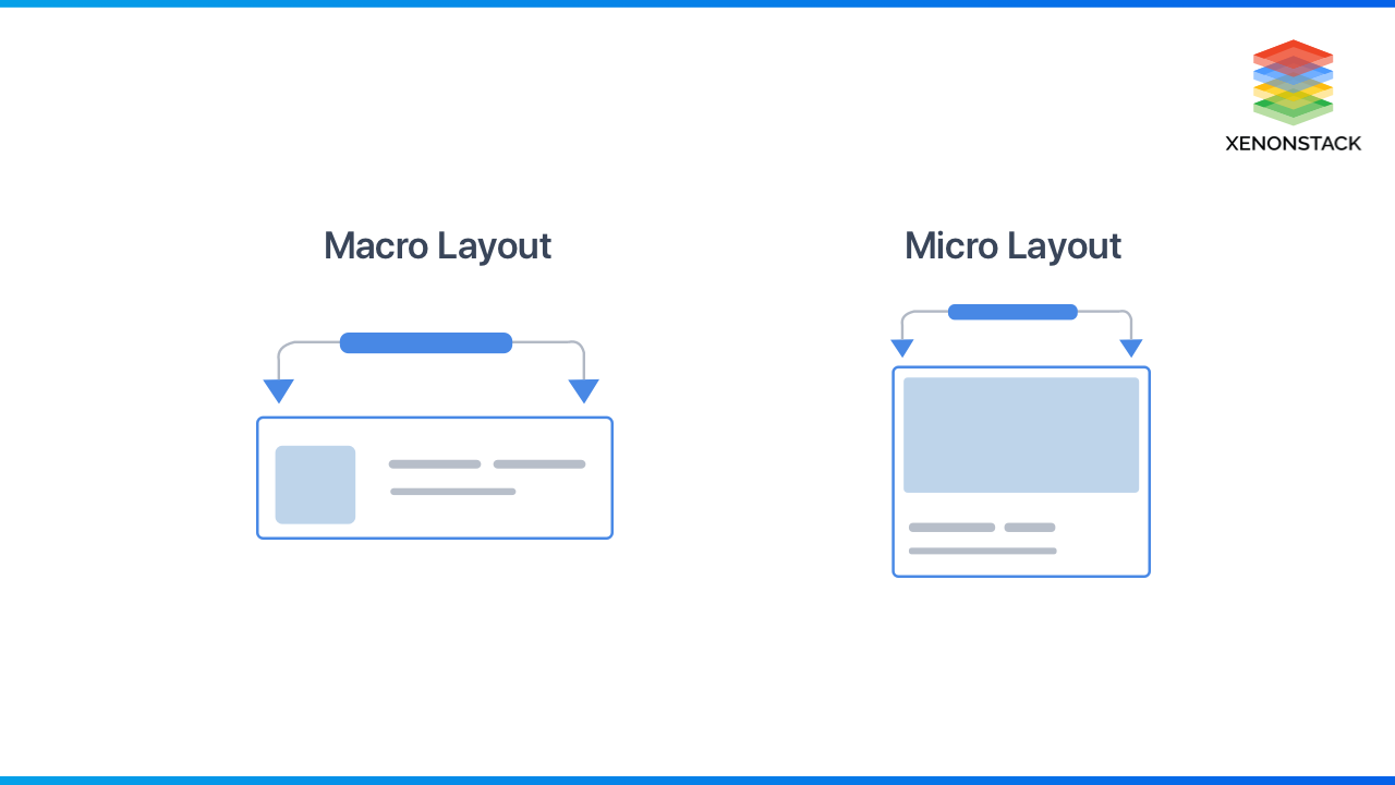
Container queries help us style based on its properties, like width and height on container's content. This takes a different approach from media queries, which is used to style the web page based on the viewport.
Responsive Designs for the Form-Factor
Nowadays, Web developers targeting dual-screen and foldable devices want to effectively layout the content in a window that spans multiple display screens, usually foldable phones. The web development platform does not provide the necessary primitives for building designs optimized for dual-screen or foldable experiences.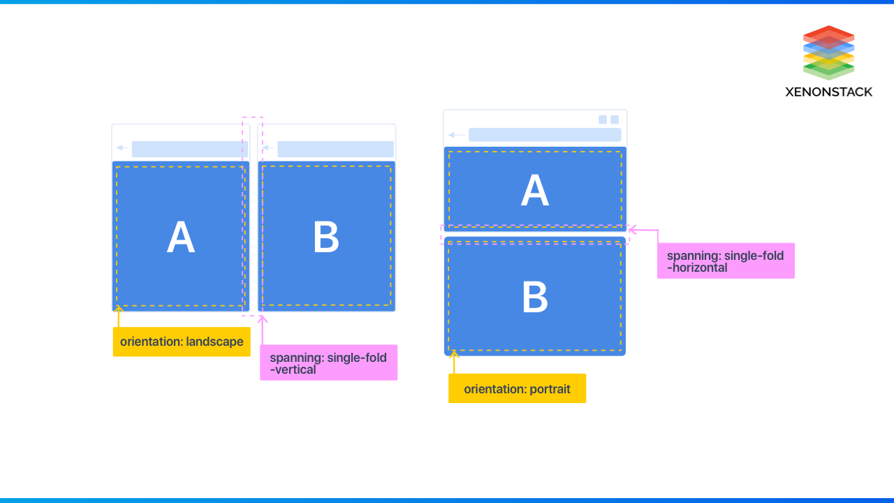
Foldable or flexible screens and designing for screen spanning are examples of where we will see a form factor shift today. And screen-spanning is yet one more spec being worked on to cover these new form factors and needs. A perfect media query for screen-spanning can be used here. It currently behaves like this:
@media (spanning: <type of fold>)

Conclusion
Component Driven Responsive design is the approach that suggests that design and development should respond to the user's behavior and environment based on screen size, platform, orientation, and user experience.
- Discover more about Building Scalable and Responsive Applications
- Click To explore about Design Thinking for Agile User Stories
- Basic Principles for Best Conversational User Interfaces


