
.webp?width=1921&height=622&name=usecase-banner%20(1).webp)
Introduction to Adaptive Design and Responsive Design
Adaptive and responsive are two different design types used by web developers to make adaptable UI for all devices. Each one of the design types has its pros and cons.
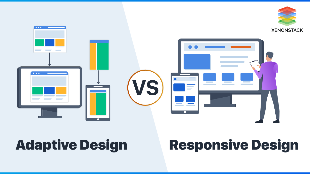
What is Adaptive Design?
The adaptive design consists of multiple fixed-sized layouts, which render according to the size of the user's device. The adaptive design adapts to the browser width only for a few specific browser breakpoints.
What is Responsive Design?
Responsive designs are designs that are capable of adapting according to browser width at any specific time. It does not depend on the browser breakpoints. It responds to the browser size at any given point.
Web crawlers help us index the content of our web pages to find relevant search terms. Click to explore about our, Website Page Structure Types and Best Practices
Key difference between Responsive and Adaptive Design
Responsive designs are fluid and can adapt to any viewport size so that they can be adaptive designs. The difference is that responsive design does not care which browser size. As the browser size changes, the layout changes accordingly. On the other hand, the adaptive design adapts to the browser's viewport by switching between the different layouts.
The Smooth and snap design
The difference between smooth and snap design is another way to think about it. The responsive design layout adapts seamlessly regardless of the device used to see it. Adaptive design, however, snaps into place because the page serves something different from the browser size or device it is viewed on.
Responsive design is a device-independent way of trying to create a screen-by-screen optimized experience. This idea requires us to create a website that changes context based on how the website is consumed on a particular occasion(either the website is viewed on mobile, laptop, or tablet). That is, containers need to be fluid (for example, using percentages as units of measurement). The size of the element updates itself according to changing viewport sizes. If we use % to set the width of an element, Then it will take only that percent of available space and reduce or increase its size according to the available space.
Compare this with an adaptive way of thinking that is neither fluid nor flexible but looks for specific points to adapt to. However, adapting a website to all the different devices can be challenging. The adaptive design delivers the right assets to the proper devices at the right time(it has a different layout for different viewports), and media queries are defined where the content breaks (for example, the mobile layout is displayed for viewport size lower than 425px, and different layout are displayed for laptop and desktop screen).
The process designers create user interfaces in software or digital devices, emphasising aesthetics or style. Click to explore about our, Principles of User Interface Design
What are the Pros and Cons of the Responsive Design?
The Pros and Cons of Responsive Design are listed below:
Pros of Responsive Design
- It eliminates the extra effort to develop different layouts for mobile websites, which in turn help in reducing the development cost.
- Responsive websites resize pictures, content, shapes, and buttons to maximize screen space, so content is simple to examine, pictures complement the screen measure, and buttons are effortlessly selectable.
- A responsive design can easily fit into today's modern web standards.
- For responsive design, You only need to upgrade your site content once ( the content size update automatically according to changing viewport sizes, as the size will be defined in percentage and rem, the site will automatically adjust itself according to the available space.).
- We don't need to make different layouts with different layout sizes for different devices.
- It can improve the website's SEO, as the search engine does not need to find mobile and static websites separately.
Cons of Responsive Design
- A few responsive websites can take longer to load. Since the pictures on a responsive location are fairly outwardly scaled down and not resized for increasing load time, smartphones and tablets can note a lag in loading speeds, mainly when utilized on a mobile network (not a Wi-Fi connection).
- Since the site is stacked vertically to adjust in little screen space, the user can neglect the page's essential highlights due to the long scroll.
What are the advantages of Adaptive Design?
The Pros and Cons of Responsive Design are listed below:
Pros of Adaptive design
- Quicker Page Loads – With adaptive design, we can exchange and show the highlights required for the given gadget and optimize all the content to the display's estimate and resolutions specific so that the page loads much quicker.
- Optimized UI for each device size – In case your site is viewed on different platforms, i.e., smartphones, tablets, and desktops, at that point, adaptive design is helpful as you can customize the page content and format them to improve UX. This allows the developer to show a different design, best for the particular devices, unlike the responsive design, where we keep the same design for all the devices.
- Serving a More Dynamic audience – Not all users have the latest gadgets which can run or read the complex code and CSS of the responsive layout, which in turn give a bad experience to the users. In adaptive design, we have a specific layout for different devices which do not have such complex code or CSS properties.
The limitations of Adaptive design
- Labor-intensive – Numerous designers prevent using adaptive design since there's more repetitive work. We have only one HTML and CSS property through responsive design, which will adapt to different device sizes accordingly. In adaptive design, we need to write different codes for different devices requiring more time and effort.
- Proficient Required – Adaptive web design regularly requires a strong group of proficient engineers who know how to handle the complexities of different devices. We need to change the design for the different viewports to bring the best out of the UI in every device. This will disadvantage small businesses with constrained assets (minimum resources).
The design or the system through which the user and the computer interact. Click to explore about our, Conversational User Interfaces
How to decide which design is better for your use?
Here are the few factors to consider while deciding between responsive and adaptive design
Consider your target device
The adaptive design will be a good option if you design your website for specific device sizes or hardware since it will eliminate the extra effort to make the same design responsive for all devices.
New site or existing site
Suppose you are enhancing an existing website to make it responsive instead of investing in a responsive framework. In that case, the adaptive design allows you to cater content to different browser sizes and make it responsive for small devices.
If you are building a new website from scratch, the responsive design will be more helpful in creating a fluid layout that will respond to all viewport sizes.
Current Traffic
Suppose your device is specifically designed for a few specific resolutions, and a few specific dimensions dominate your incoming traffic ratio. In that case, your design should also be specified for those particular browser dimensions/viewport.
On the other hand, If your website has an equal share of traffic from all different sizes, then responsive design is better suited for your website.
The main thread is where the browser handles most of the work involved in page loadings, such as rendering/painting content.Click to explore about our, Ways to Minimize the Main Thread Work
Conclusion
Adaptive designs are only responsive to a limited specified viewport size(i.e., 768,1024,2440), whereas responsive designs are responsive in the specified viewport sizes and dimensions between these specified viewport sizes. Responsive designs are more reliable today, where we have various dynamic size gadgets. With responsive web design, we can generate fluid layouts, which are capable of fitting according to the viewport size in which the user sees it.
- Discover more about Customer Experience (CX) vs. User Experience
- Explore here the Design System and User Experience Solutions


