What is Visual Analytics?
Visual Analytics is the scientific visualization to emerge an idea to present data in such a way so that it could be easily determined by anyone. It gives an idea to the human mind to directly interact with interactive visuals which could help in making decisions easy and fast. Visual Analytics basically breaks the complex data in a simple way. The human brain is fast and is built to process things faster. So Data visualization provides its way to make things easy for students, researchers, mathematicians, scientists etc.Why Visual Analytics is important?
There are a couple of reasons listed below that would witness that why there is a need for Visual Analytics: Following are:-- The first reason would be the processing of human mind, how fast it is to process/understand charts/tables much clear and faster than anything like reports and big spreadsheets.
- It highlights the factors that influence the customer behavior.
- Help us to take important decisions before the product is delivered.
- Help us to analyze the working of the things anytime.
- Identifies the areas that are needed to take attention or improvement.
A quick, easy way to convey concepts and summarize and present large data in easy-to-understand and straightforward displays, which enables readers insightful information. Click to explore about, Advanced Data Visualization Techniques and its Features
What is Data Visualization?
Data visualization is presenting abstract data in a graphical format. Visual Analytics combines analytical reasoning with the data visualization through which one can judge the complex scenarios and take decisions according to it.What are the best Data Visualization Techniques?
This section will cover a few data visualization techniques. This will help you to understand the whole topic in an easy way. Here are some of the tips that you need to keep in mind:- Before starting to understand the data. Like the size of the data, how much effort it will take.
- Understand the need of the audience in your mind and according to that visualize the data.
- Always keep the result output in your mind.
To explain this in further more detail. Here are four major points to always keep in mind before starting with data visualization.
Purpose: Defining your purpose is the most important. To split this up.
- Why i am creating this.
- Who is for?
- What do they need to understand?
- What actions do I need to enable?
- How will it be consumed?
- What is the most important takeaway message?
- What data matters?
- What you need, your requirements
- Less is more, guided by purpose
- Less content simplifies learning.
- You have to decide whether you need an umbrella or not?
- There are thousands of graphs in the market. You have to decide?
- Decide what structure will fit your data the most.
- Focus on the data, remove the distractions.
- Make your data clean enough to visualize easily.
3D visualizations visualized with the three-phase process of scene, geometry, and rendering. Click to explore about, 3D and Multidimensional Data Visualization Technique
What is CanvasJS?
CanvasJS is a charting library provided support with html5 and javascript for rendering high-end visual charts. CanvasJs works on various platforms:- Android
- Windows
- Mac
- Desktop
- iPhone
- Ipad
Why CanvasJs is important?
CanvasJs provides high-end rich dashboards embedded with beautiful visual charts to enhance the user attraction and to provide rich behavior without any need to worry about maintainability and functionality. Canvas Js provides:- Full customizable themes
- Works on today’s modern devices
- Standalone - does not depend on other libraries
- High-end performance
- Full support from developers
- Easy to understand expecting knowledge of HTML and javascript to get started
Data Visualization is a method of translating raw data into visual forms like charts, graphs, and maps. Click to explore about, 10 Best Practices for Data Visualization
Difference between CanvasJS and D3.js
Canvas is nothing but an HTML element, but when integrated with HTML5 and javascript, it makes a huge difference to visual analysis and performance. In D3 SVG element, one can include thousands of elements but in the case of canvas charts, a full pixel size image is produced. As a result, rendered image is full of pixels with great visuals. Using D3 svg, one can select all the elements and modify the output according to it. As a result of this process sometimes become complex to adopt and makes an impact on performance.What are the features of CanvasJS?
CanvasJs features are listed below:- Elegant looking Charts
- Light Weight
- High Performance
- Runs on Chrome, Firefox, Safari, IE8+
- Tablet and Mobile Ready
- Retina Ready
- Wide range of Customizable Charts
- Dynamic / Real-time Charts
- Zooming
- Panning
- Export as Image – JPEG / PNG / Print
- Animations
- Beautiful Themes
- Custom Color Sets
- Localization
- Number & date Formatting Themes
- Synching charts
- Axis
- Chart Title, Subtitles
- Legend
- Tooltip
- Markers
- Mouse Events
- Tick Marks
- Grid Lines
- Interlaced Colors
- Methods to convert pixel coordinates to axis value and vice-versa
Data Visualization software tools, outlines, and diagrams are slacked by information representation devices. Click to explore about, Best Data Visualization JavaScript Libraries
Data Visualization with CanvasJS
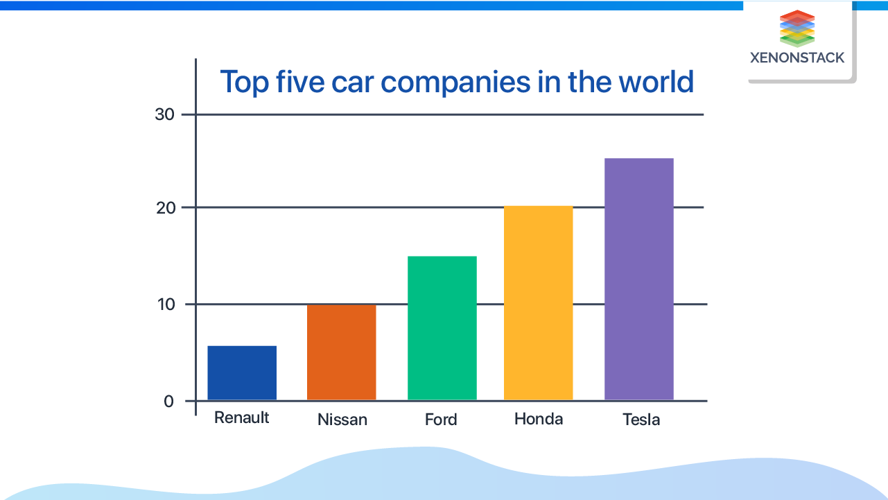
Consider some raw data related to the top five car companies in the world corresponding to their positions, as shown in fig.| Top five Cars | Car Position |
|---|---|
| Renault | 5 |
| Nissan | 10 |
| Ford | 15 |
| Honda | 20 |
| Tesla | 25 |
 Canvas js visualize the raw data and integrate it with HTML and javascript code to provide full performance and functionality to the charts. Below code will give you an idea about how easy to write code using canvas because canvas includes inbuilt functionality and libraries which reduces the line of code and helps to deliver things faster rather making complex codes which sometimes become hard to understand.
 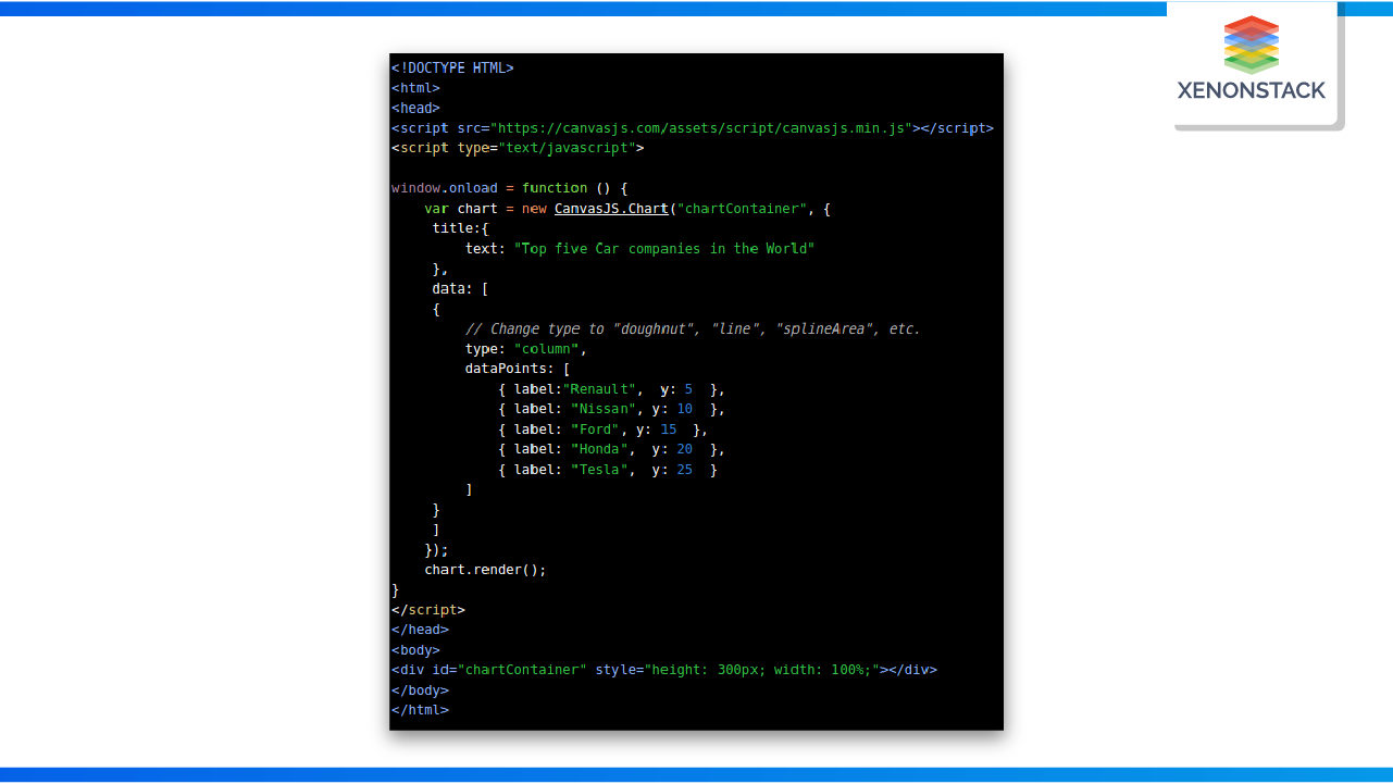 Ready to create your first chart using CanvasJs? The above code can be used to create different types of charts. Let’s get started.
- First, copy the code and save to your HTML file.
- Run the saved HTML file locally.
- You will see a column chart rendered on your page.
- Now start changing the type parameter to “line”, “bar”, “splineArea”, etc… and let CanvasJS handle.
- Chart: Instantiate a new Chart object by passing ID of div element where the chart is to be rendered. You can also pass DOM element to it.
- Now pass all the Chart related “options” as the second parameter.
chart.render: chart.render()method will return the chart.
- Title: title object has text property to set text.
- DataPoints: which is an array containing all the data points to be displayed on the chart.
- Data Series: parent to the dataPoints defines the type of chart and another set of options.
- Data: which is an array containing one or more data series.
Concluding CanvasJS
- To sum up, CanvasJs is a great tool for presenting complex visual analytics data.
- It can handle a large amount of complex data and convey a lot of meaningful information.
- The scope of CanvasJs will increase in the future because of its easy feasibility with javascript and HTML.
- One should have basic knowledge of HTML and javascript to get things started.
- Charts made through Canvas Js consume less time.
How Can XenonStack Help You?
Create Interactive, Intuitive, and Visually Appealing Dashboards for Data Visualization.XenonStack provides data visualization solutions for engaging and Interactive dashboards for Real-time and Batch Analytics and Visualization of IoT Devices and Network components. XenonStack Provides customized and Reusable templates and Data visualization solutions using React.js,HighCharts,Canvas.js and d3.js. XenonStack helps enterprises with data exploration and visualization of a large dataset from 2 million records to 100 million records.
- Know about Visual Analytics tools and Processes for Data-Driven Decisions
- Click here to read about Tableau Data Visualization
- Explore here about Data Visualization with Microsoft Power BI